Board index Off Topic Board Off Topic Discussion And now, For My Pointless Invention of the Day...

And now, For My Pointless Invention of the Day...

Here, anything goes. Talk about anything that you would like to talk about!


Posts: 826
Points on hand: 2,400.00 Points
Location: Edmonton, Alberta, Canada

Image
Image
Yaaayyy.

The area under the touch buttons [play < menu > home] is a scroll pad that you cant see, and tapping it with your thumb is 'ok.'

That concludes my completely and utterly pointless invention of the day, thankyoukbai.
Last edited by CalawayPark on December 11th, 2007, 3:31 pm, edited 1 time in total.

Post December 11th, 2007, 8:14 am

Posts: 441
Points on hand: 1,152.00 Points
Location: Nelo, Antwerp, Belgium

Post December 11th, 2007, 9:42 am

Posts: 2748
Points on hand: 4,830.00 Points
Location: Medinah, Il, USA

Actually, even though it is like the zune I like this one much better. It is so simplistic it looks great!

Post December 11th, 2007, 11:26 am

Posts: 5852
Points on hand: 5,806.00 Points
Location: Toronto, Ontario, Canada

It looks pretty emo with all the dark colours and whatnot.

Post December 11th, 2007, 12:49 pm
TheArchitect User avatar
Premium Member
Premium Member

Posts: 1331
Points on hand: 501,147.00 Points
Bank: 498,048.00 Points
Location: Dorchester, Dorset, United Kingdom

Post December 11th, 2007, 1:06 pm

Posts: 281
Points on hand: 892.00 Points
Location: Netherlands
lol the screen isnt in the center...
buttersafe is extremely funny

Post December 11th, 2007, 2:02 pm

Posts: 1830
Points on hand: 3,960.00 Points
Location: London, United Kingdom

Originally posted by Mikado

http://weblogs.nrc.nl/weblog/hebben/wp-content/uploads/0710/zune_2.jpg

Looks a lot like zune.. I kneeew you secretly digged them[:D]


and Zune's are a MICROSOFT product :O
Rarwh

Post December 11th, 2007, 2:19 pm

Posts: 826
Points on hand: 2,400.00 Points
Location: Edmonton, Alberta, Canada

It doesn't look like the Zune, the only similar thing is the way the glimmer is on the machine....

This doesn't have a squricle, a disgusting menu with nothing but over sized arial text, an unintuitive interface that makes no sense, it's huge, it's thick and it's got square edges. It feels cheap and plasticky and the software doesn't work worth a crap. The software design has a terrible interface much like the player itself and you can't even use music on it that you've bought from other Microsoft PlaysForSure stores. The design is terrible, and the flash Zune looks like a screaming monkey with the two eyes and the squricle.

Not to mention this:

Image
[Note that the original colours are brown and how the cube becomes complete after you flip it.]

That pretty much sums up what I think of the Zune, and this looks more like the iPod, I envisioned it to have a chrome back like the nano, and it's FAR thinner then the Anus.

Originally posted by Canadmos

It looks pretty emo with all the dark colours and whatnot.


You must love it then [:D]

Post December 11th, 2007, 2:40 pm

Posts: 1180
Points on hand: 1,435.00 Points
Location: Texas, USA


Post December 11th, 2007, 2:48 pm

Posts: 441
Points on hand: 1,152.00 Points
Location: Nelo, Antwerp, Belgium
http://www.loopygadgets.com/wp-content/ ... /zune2.bmp

Square edges, tick, feels cheap and plasticky? The Zune I have now feels almost the same as an iPod.. Dude did you even ever HOLD a Zune in your own hand, cause I have the feeling you don't know where you're talking about. Still, the best way to go isn't Microsoft, nor it's Apple, but Creative [approve]

Post December 11th, 2007, 2:53 pm

Posts: 649
Points on hand: 1,771.00 Points
Location: boston, massachusetts, USA

lol. Calaway, I am going to have to come up with my own mp3 player now.

Post December 11th, 2007, 3:00 pm

Posts: 826
Points on hand: 2,400.00 Points
Location: Edmonton, Alberta, Canada

Originally posted by Mikado

http://www.loopygadgets.com/wp-content/uploads/2007/09/zune2.bmp

Square edges, tick, feels cheap and plasticky? The Zune I have now feels almost the same as an iPod.. Dude did you even ever HOLD a Zune in your own hand, cause I have the feeling you don't know where you're talking about. Still, the best way to go isn't Microsoft, nor it's Apple, but Creative [approve]


Uh, you do realize that's NOT the Zune 2? The Zune 2 is way thicker, that's a mock up done by some kid with a 3D modeling program. The Zune 2 looks like this:
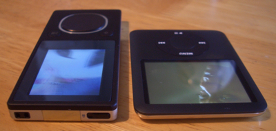
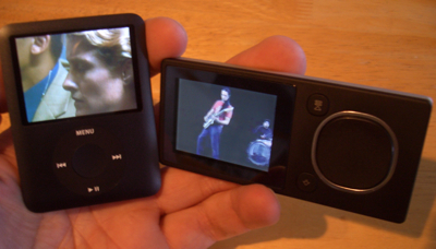
Image
Image

Zune 1 and iPod.
Image

Not to mention it has a smaller screen then the nano WITH it turned to the side, and they have extra room for more screen on the effing machine.

It's unintuitive, when you turn it to the side, the touch controls work the same but the buttons all change position and when you first use it you'll start pressing the wrong button, you have to read it to know where the buttons are.

And yes I've held a Zune and a Zune 2, I thought about buying a Zune 2 until I actually used the machine.

It's unintuitive, and it's a piece of crap and it's not what I came here to talk about, k?

Post December 11th, 2007, 3:30 pm

Posts: 826
Points on hand: 2,400.00 Points
Location: Edmonton, Alberta, Canada


Post December 11th, 2007, 3:46 pm

Posts: 649
Points on hand: 1,771.00 Points
Location: boston, massachusetts, USA

Heres mine:

Image

Both are touch screens, and when you hit the menu button on the larger one, the song info turns into the main menu. The bar on the left side is volume. You use your fingers to scroll down. When watching a movie or viewing photos, the menu at the top of the lager screen moves away, and it becomes fullscreen. It is called Eclipse.

Post December 11th, 2007, 3:56 pm

Posts: 826
Points on hand: 2,400.00 Points
Location: Edmonton, Alberta, Canada

I think it looks kind of tacky and unintuitive because there's nowhere to hold it with one hand and you have to use 2 to use it.

I like it but I think it could use some work- especially your interface design. I really don't like it.

Post December 11th, 2007, 4:01 pm

Posts: 281
Points on hand: 892.00 Points
Location: Netherlands
I like it

I really don't like it

lol
buttersafe is extremely funny

Post December 11th, 2007, 4:05 pm

Posts: 649
Points on hand: 1,771.00 Points
Location: boston, massachusetts, USA

Well, considering yours doesn't even have an interface...

Post December 11th, 2007, 4:09 pm

Posts: 826
Points on hand: 2,400.00 Points
Location: Edmonton, Alberta, Canada

Image

Encore: Glow

Image

Encore: Night

Image

Encore: Sky

Image

Encore: Violet

Image

Encore: Rose

Post December 11th, 2007, 4:25 pm

Posts: 281
Points on hand: 892.00 Points
Location: Netherlands
Ok, interface is crap, the rest looks good. Except the screen that still isnt in the center[;)] As an Apple fan you should look to the iPod for the interface. And for the rose and violet ones... I don't like them
buttersafe is extremely funny

Post December 11th, 2007, 4:32 pm

Posts: 826
Points on hand: 2,400.00 Points
Location: Edmonton, Alberta, Canada

Originally posted by Sjaggerijn

Ok, interface is crap, the rest looks good. Except the screen that still isnt in the center[;)] As an Apple fan you should look to the iPod for the interface. And for the rose and violet ones... I don't like them


How's the interface crap? It's exactly the same as the iPod it just looks different... You can change your background image on this too, but you can't on iPod.

Whateva, your opinion. I like all the colours :)

Post December 11th, 2007, 4:52 pm

Posts: 441
Points on hand: 1,152.00 Points
Location: Nelo, Antwerp, Belgium
I like sky and the white one the most. Any idea of how the back of the device is looking like? I would go for some etched shiny metal, like the back of a Nokia 7370: http://phone.mobile9.com/img/nokia-7370-5.jpg

Post December 11th, 2007, 4:58 pm

Posts: 826
Points on hand: 2,400.00 Points
Location: Edmonton, Alberta, Canada

I was thinking glossy plastic or chrome, the chrome would have a clear plastic cover on it though to prevent scratching.

I'm leaning toward plastic, considering the sky, rose and violet colours could all have their theme colours on the back.

Post December 11th, 2007, 6:11 pm

Posts: 281
Points on hand: 892.00 Points
Location: Netherlands
Originally posted by CalawayPark

Originally posted by Sjaggerijn

Ok, interface is crap, the rest looks good. Except the screen that still isnt in the center[;)] As an Apple fan you should look to the iPod for the interface. And for the rose and violet ones... I don't like them


How's the interface crap? It's exactly the same as the iPod it just looks different... You can change your background image on this too, but you can't on iPod.

Whateva, your opinion. I like all the colours :)


The interface just looks so... so... like you did it in 10 seceonds... or something... And if you look at the iPod you see it has to few menu options
buttersafe is extremely funny

Post December 11th, 2007, 6:20 pm

Posts: 1180
Points on hand: 1,435.00 Points
Location: Texas, USA

That interface looks like the Zune.

And as if interface of an iPod matters. iPods fail miserably at providing any sort of accessibility outside of Apple itself. Why can't I use non-iTunes songs without going through bullshiz? Why can't I import my movies without going through even more bullshiz? Who plays games on that anyway?

And once Apple learns to fix those problems (which it won't) maybe it won't suck.

If at all, PSP's are probably the best out there. They can access internet (which there is only one of), play games (using both the UMDs and Emulators and downloads), play movies (both download and UMDs) and you can switch out your memory cards for unlimited space. And the memory cards are cheap, too.

Oh, and they have a big screen.

Post December 11th, 2007, 6:20 pm

Posts: 826
Points on hand: 2,400.00 Points
Location: Edmonton, Alberta, Canada

Originally posted by Sjaggerijn

Originally posted by CalawayPark

Originally posted by Sjaggerijn

Ok, interface is crap, the rest looks good. Except the screen that still isnt in the center[;)] As an Apple fan you should look to the iPod for the interface. And for the rose and violet ones... I don't like them


How's the interface crap? It's exactly the same as the iPod it just looks different... You can change your background image on this too, but you can't on iPod.

Whateva, your opinion. I like all the colours :)


The interface just looks so... so... like you did it in 10 seceonds... or something... And if you look at the iPod you see it has to few menu options


It's minimalist, and it's not supposed to jump out and make your eyes explode lol. And did you ever think that you could you know, scroll down?

Zoozer, don't be stupid. YOU THINK IT SUCKS, not every god damned person so stop speaking for everyone, I HATE that. If the chuffing player was THAT BAD it would NOT have that much market share that was started from noting! So don't even.

And how the hell is there hassle getting your songs onto it? It's called drag and drop them into the iTunes library...


I own a PSP and I think it's terrible. I think that nearly all of the games are terrible, the music features are mediocre at best, no movies are even getting put on UMD anymore, the games and movies are over priced in my mind, the machine is way too big IMO and the interface is not very good.

IN MY OPINION.

Next

Return to Off Topic Discussion


  • Related topics
    Replies
    Views
    Last post