Board index ‹ Roller Coaster Games ‹ No Limits Coaster ‹ Color Schemes for NoLimits Coasters
 September 1st, 2011, 3:46 pm
Color Schemes for NoLimits Coasters
16 posts
• Page 1 of 1

Im in the process of a new coaster. It wont be bad like Tsunami was...I'm on my 6th day of trackwork and im still working on it. Then im gonna do my own supports for it. i I really need some ideas for a good color scheme that is unique and new. If tou have any ideas comment them below.

Depends on the style of your coaster. If it's tight and twister go for some more fierce reds. But if it's more smooth and flow-y something more subtle like pastal greens/blues.
Coaster Count - 198
France 2019 Mini Trip Report
France 2019 Mini Trip Report
Its a Intamin coaster, but its not that big soo...
And i dont really wont to use blue again. I use it alot
And i dont really wont to use blue again. I use it alot
Try two colors that are right next to each other on the spectrum. Like red and red orange, or blue and purple, or dark green and lime green. Or pick a color and put it with an accent color, like picking magenta for a track, and putting it with a subtle brownish, or tan, or grey, or silver, or blackish gray supports. That would make the track pop.
Thanks. Ill try some of those and see how it looks
Red and Orange is disgusting. Please don't use that. But other than that...it really depends on what you want the ride to be like. One thing I've noticed is, if you're using a gray, don't use simple gray. Add some blue (or red...or yellow, depending on your other colors in your scheme) to it to make it feel more "real". Simple gray turns out ugly in NL. I did that on New Moon and I personally think it turned out beautifully.
I think that red and orange looks disgusting too. I couldnt decide between a really nice green and a cool pink so I did a really neat thing with the colors.
@boneplaya Im gonna do gray supports. Ill probably add blue to it.
Can I ask a totally random question... Im trying to put pictures in but is says they are too big in size. How can I get the size lower????
@boneplaya Im gonna do gray supports. Ill probably add blue to it.
Can I ask a totally random question... Im trying to put pictures in but is says they are too big in size. How can I get the size lower????
It really depends on the coaster, red and orange CAN look good sometimes, just not on any coaster.
Same with white. Adding a tint of some kind really livens up the atmosphere. Very, VERY subtle tint, though.
Im trying to put pictures in but is says they are too big in size. How can I get the size lower????

change the file type
What are these for?
I found out how!!!! Pics comin soon!!!
Image Insert:
126.63 KB
Image Insert:
90.14 KB
Image Insert:
112.81 KB
Image Insert:
94.73 KB
Image Insert:
85.04 KB
Image Insert:
112.32 KB
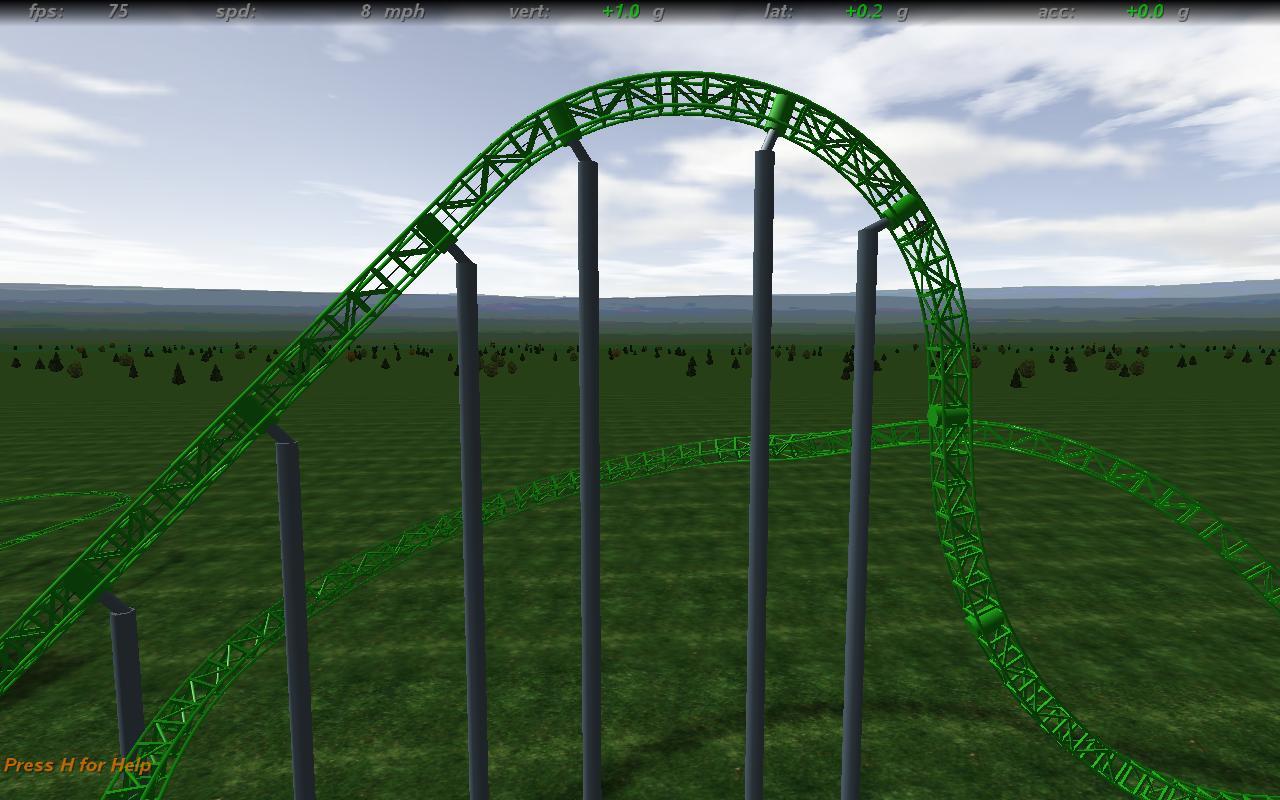
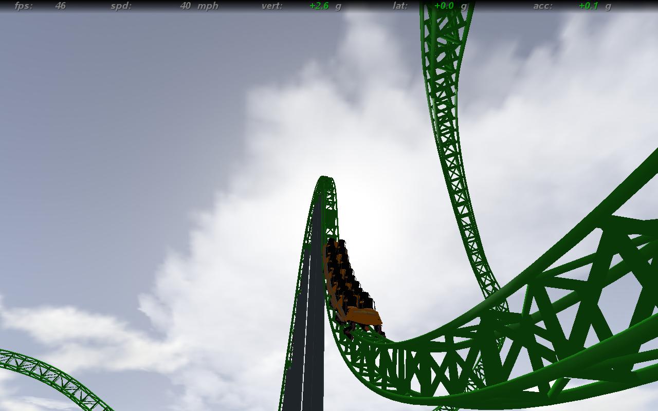
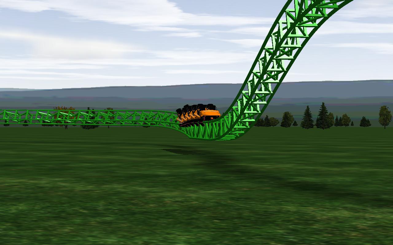
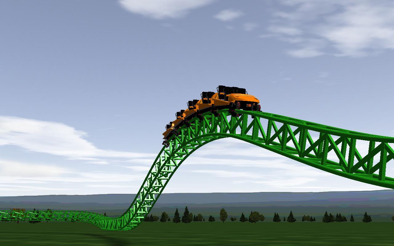
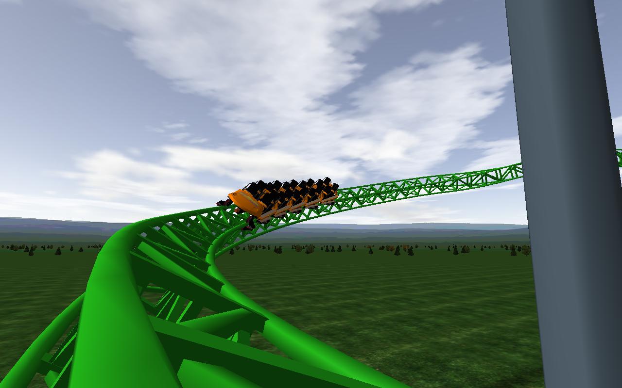
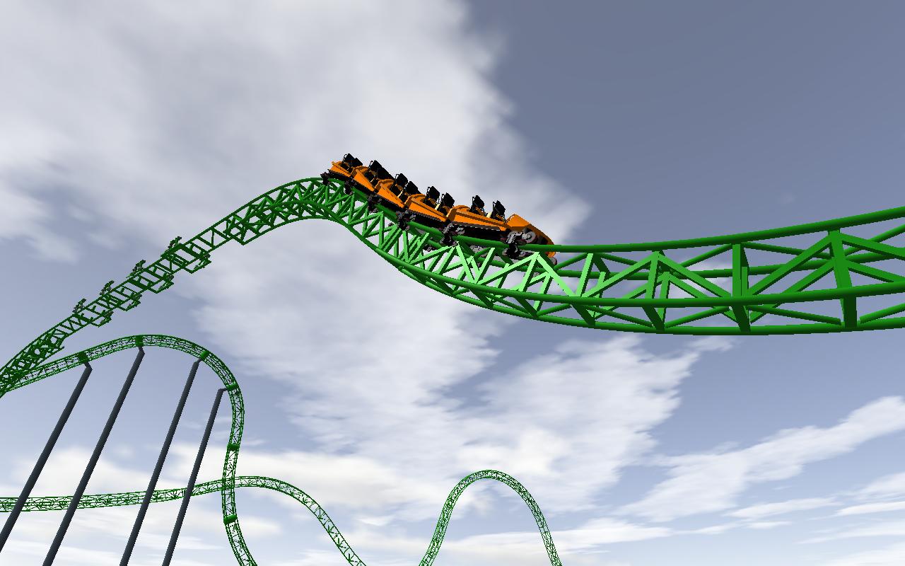
Here are the pics [:D] Sorry cant show ending thats where the suprise is...
126.63 KB
Image Insert:
90.14 KB
Image Insert:
112.81 KB
Image Insert:
94.73 KB
Image Insert:
85.04 KB
Image Insert:
112.32 KB
Here are the pics [:D] Sorry cant show ending thats where the suprise is...
It would be helpful if you had some more supports (even if they are just presets) to get a feel for the colour scheme. It's much easier to tell if it looks good when they're on the whole coaster, not just the lift hill.
I would reduce the saturation on the green track a bit, greens don't often look that bright in real life unless there is perfect lighting.
I can't quite tell from the screenshots, (It might just be the lighting) but are the ties a different colour to the rails and spine? If they are you shouldn't do that if you want your ride to look realistic.
I won't comment on the rest of the track, since I don't think that is the purpose of is thread. If you want some advice on that, post in the hard hat area or get a mod to move this thread.
Green is ugly and overused. I like black,black and red,metallic siver or metallic shades of gold,copper and bronze on Intamin steel.
16 posts
• Page 1 of 1
-
- Related topics
- Replies
- Views
- Last post
-
- Top 5 NoLimits Coasters Ever
1, 2, 3by deadlyadder » May 19th, 2009, 11:06 pm - 58 Replies
- 8473 Views
- Last post by AV8R

April 5th, 2010, 6:46 pm
- Top 5 NoLimits Coasters Ever
-
- NoLimits DEATH Coasters
by hzgarfield » February 13th, 2012, 5:54 am - 11 Replies
- 2643 Views
- Last post by TheArchitect
November 13th, 2013, 10:49 am
- NoLimits DEATH Coasters
-
- Motion Simulator - Ride NoLimits Coasters?
by A7 » June 6th, 2008, 8:25 pm - 19 Replies
- 2686 Views
- Last post by Cade
June 7th, 2008, 4:29 pm
- Motion Simulator - Ride NoLimits Coasters?
-
- Color
by topthrillmaniac » August 25th, 2004, 11:04 am - 1 Replies
- 638 Views
- Last post by DjJavixxxxx
August 25th, 2004, 11:13 am
- Color
-
- COLOR
by mattramirez0 » August 20th, 2009, 12:52 am - 5 Replies
- 924 Views
- Last post by thundermat
August 20th, 2009, 8:02 pm
- COLOR
