Originally posted by SauronHimself
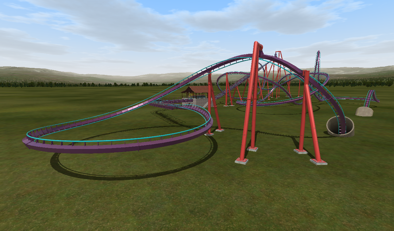
As a suggestion, you may wish to choose another color scheme. When I see the combination of green track, uphill launch, and zero-G roll out of the gate, I think Incredible Hulk Copy.
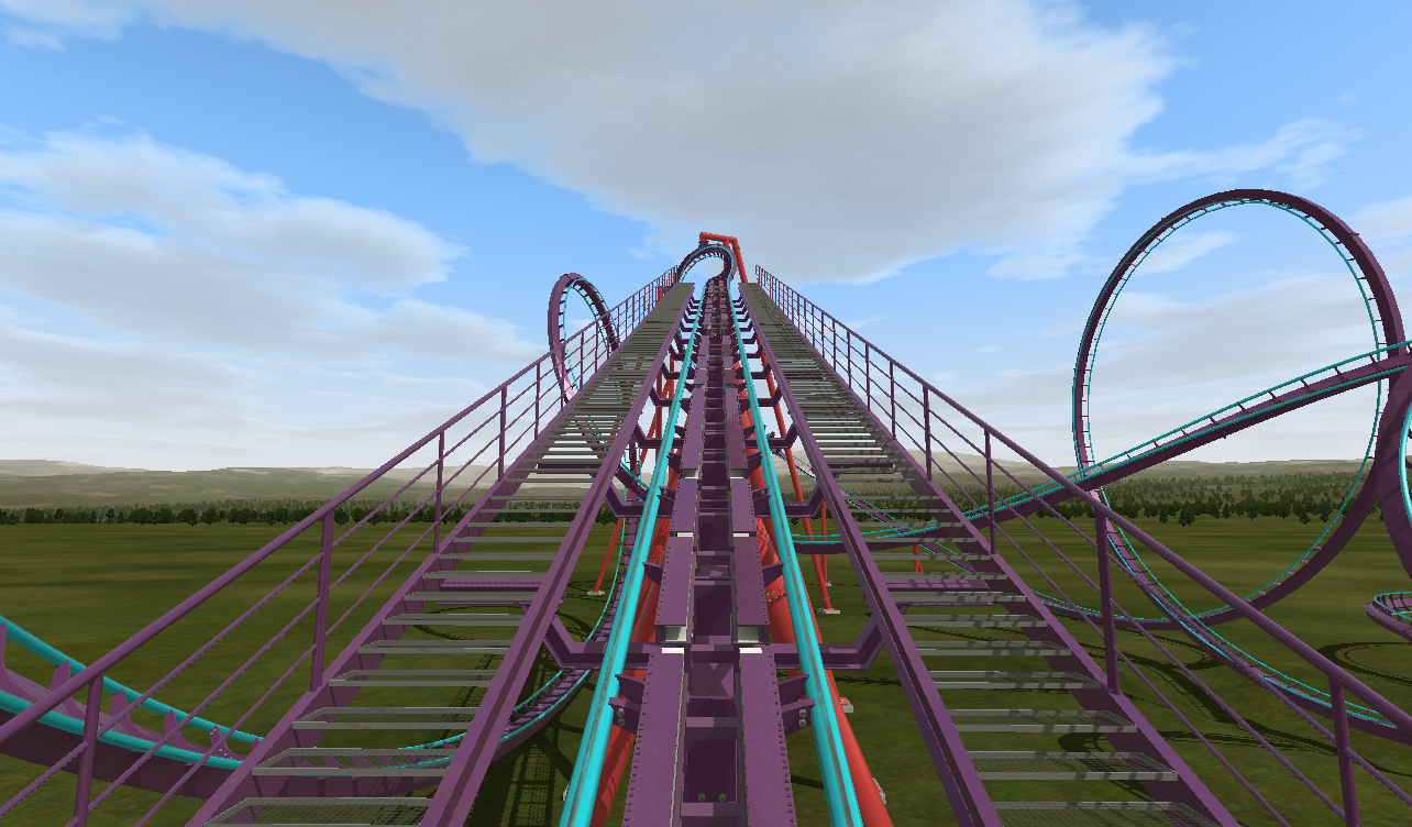
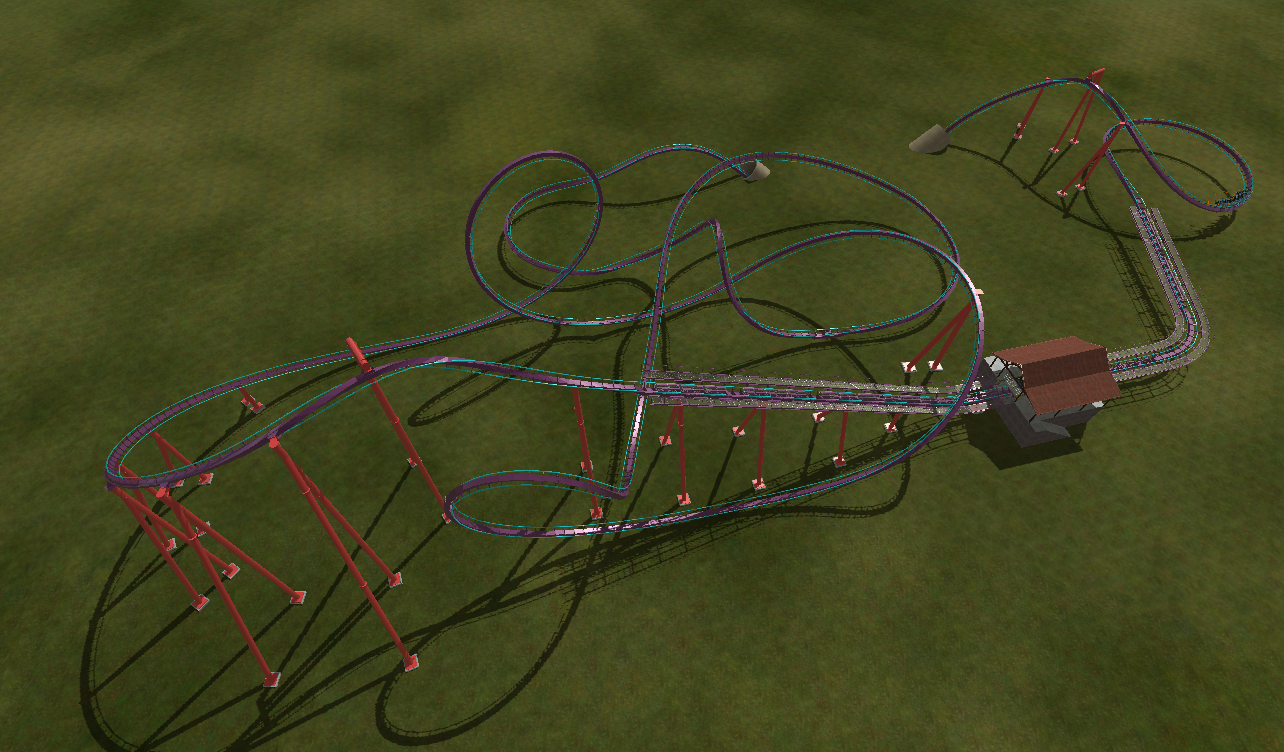
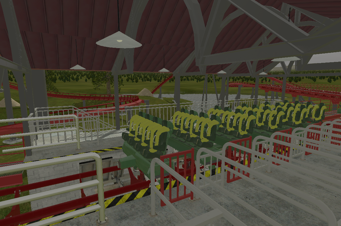
I'm not trying to be snippy, this is a serious question: don't you think that's kind of a you issue, if you can't separate the two? I mean clearly the opening was Hulk inspired and it's not as if I'm trying to hide that(although it's not a rolling launch, anyway) but the rest doesn't really have a touch of Hulk in it, nor is it the same color whatsoever. That's like saying every green standup that has an oblique loop is too much like Green Lantern or Riddler's Revenge, IMO, or maybe every blue Intamin hyper with an overbank is too much like Millennium Force or Bizarro. Thanks for the suggestion, but I'm happy with this scheme.
Besides, Hulk is the only real-world example we have of this. B&M has made a habit of using and reusing elements from other rides; just look how similar something like Mantis and Chang/Green Lantern are, or how a bunch of their sitdown and floorless use the exact same vertical loop-dive-zero-G-cobra-(two)corkscrew pattern. Definitely not the same, but lots of them have elements pulled from other installments. I believe it's not so far-fetched to think that another B&M launcher could borrow some things from their one extant example, and it's barely the first 200 feet of track.
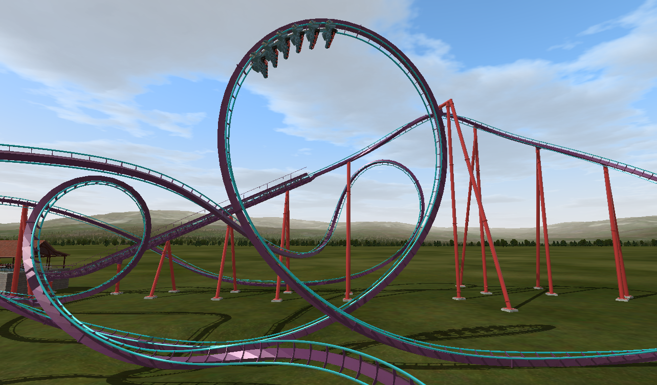
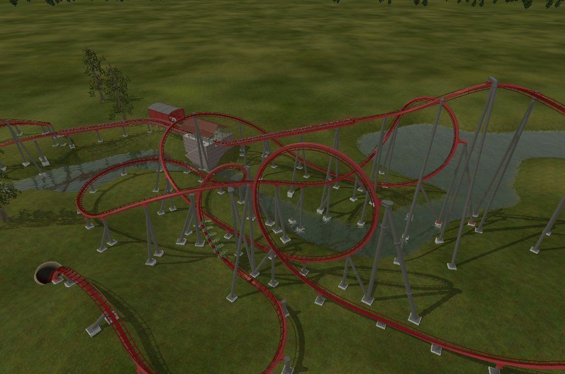
Coasterkid, of course you're right that it's just what makes me happy but I also am a big coaster fan (obviously, who here isn't) and AM interested in getting the supports at least close to what they should be. I am guessing you're referring to that horizontal beam in in the loop support; I felt that the angle was too wide for there not to be a beam because there's a piece of track in the way of where the footer should ideally be. Do you think I can just remove that horizontal beam, knowing that the angle of the support basically has to stay as is?
There's only one or two other horizontal beams around that I've now removed, and it definitely looks better. It's just the one on the loop bracing I'm wondering about because of the footer placement, and one other that is a specific circumstance and I'll probably keep.
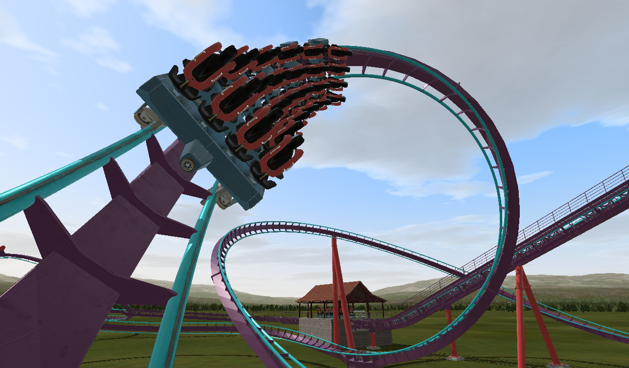
Did you see my question about recreating the B&M-specific loop connector?
