Board index Roller Coaster Games Hard Hat Area Project Splicer - Finally Working!

Project Splicer - Finally Working!

The Hard Hat Area is the place to post construction news about your ride, so this is the place to hype your future upload!

Post June 14th, 2008, 9:40 pm

Posts: 312
Points on hand: 121.00 Points
Location: USA
Here's a few quick notes before we get to the actual coaster.

1) I haven't touched NoLimits since the end of January before this project.

2) I didn't start a thread sooner due to the fact that every other time I create a thread, I don't finish the coaster. This time, I did a lot of track work first to ensure that I would complete the coaster.

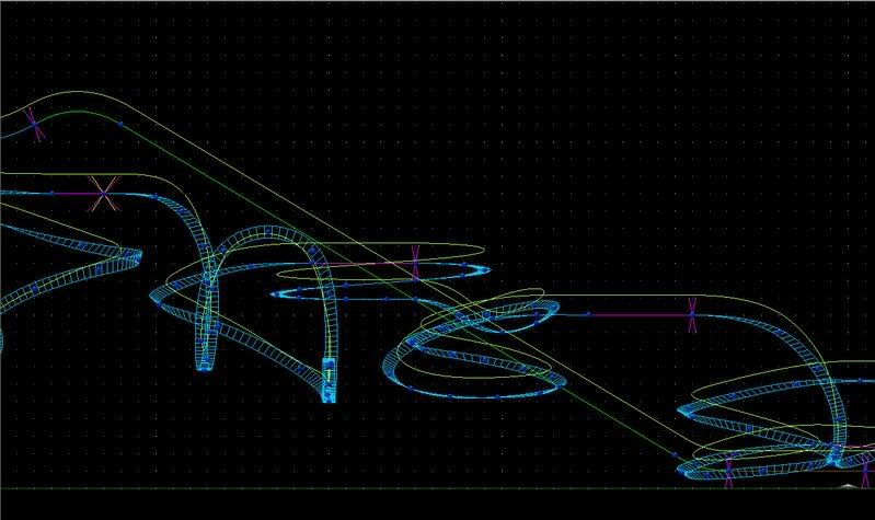
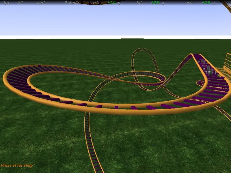
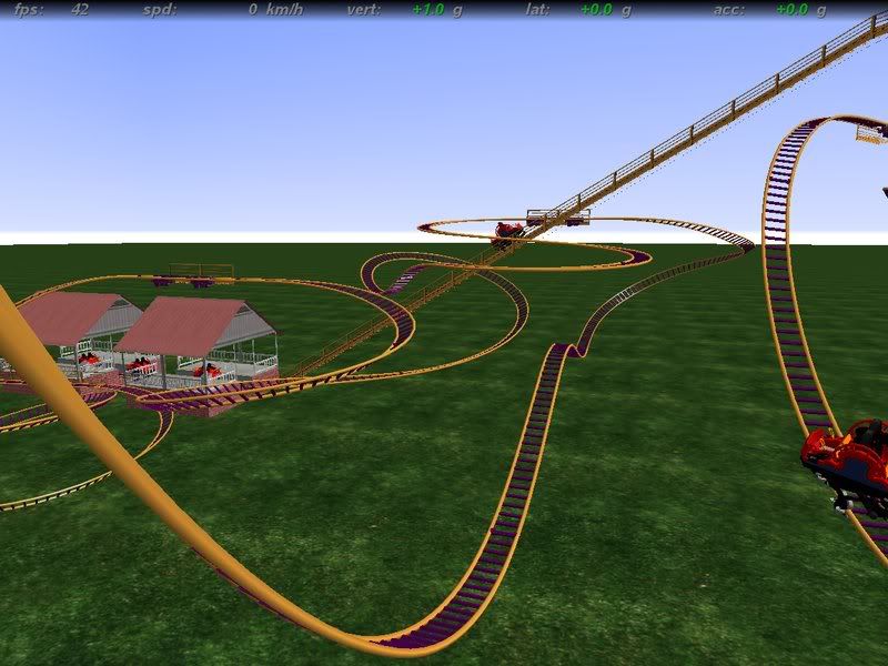
Ok, now to the actual coaster. As the subject says, this is Project Splicer (temporary name), a Maurer Sohne Spinner. This is my first attempt at a spinner, and I am happy of what has come about so far. Project Splicer is approximately 1810ft long, about 72ft tall(from bottom of grid), and carries 5 cars on its track. Now enough of me talking, here are some pics.

**Note: GerstlCrazy took these shots for me because my computer is being stupid and wont save images.**
Image

Image

Image

Give me your opinion please! [approve]

P.S. The colors (only the track; cars are definately changing) are experimental. They may or may not stay that way.
Last edited by CoasterStreak on July 13th, 2008, 11:04 am, edited 1 time in total.

Post June 15th, 2008, 6:50 pm

Posts: 814
Points on hand: 290.00 Points
Location: London, United Kingdom


Post June 15th, 2008, 7:29 pm

Posts: 28
Points on hand: 1,532.00 Points
Location: USA
Amazing, can't wait for more. I also have your problem, not being able to finish a track ... :(

Post June 15th, 2008, 7:37 pm

Posts: 604
Points on hand: 1,495.00 Points
Location: Plano, TX, USA
You should definitly finish this one! I bet it will turn out good.
Is now 15!

RIP Wildcatter, 1982-2007.

Post June 15th, 2008, 7:45 pm

Posts: 312
Points on hand: 121.00 Points
Location: USA
Thanks for the comments.

And alton, that is my plan. I want it to be on the side of a small hill with maybe a small pond/lake somewhere near it.

I also wanted to do 3ds, but the computer I can do that on crashed, so I'm am currently working on building a station out of supports. It is going to be really colorful, I'll tell ya now. After I work on them a little more tonight I will post a picture or two of what they are probably going to look like [:D]

Post June 15th, 2008, 9:23 pm

Posts: 1138
Points on hand: 3,691.00 Points
Location: Toledo, Ohio, USA

Post June 15th, 2008, 9:31 pm

Posts: 312
Points on hand: 121.00 Points
Location: USA

Post June 15th, 2008, 9:33 pm

Posts: 1138
Points on hand: 3,691.00 Points
Location: Toledo, Ohio, USA
ok, take a picture right now.
now when you go to the NL screenshots folder, click compatibility files above where the pictures should show up.
i could never take pictures either, i clicked that randomly one day, and they all showed up. lmao, tell me if that works.

Post June 15th, 2008, 10:21 pm

Posts: 312
Points on hand: 121.00 Points
Location: USA
AH! Thank you sooooo much! That has been bugging me a lot since I got this laptop.

Anyway, here is the picture of the station. Now I know the colors are a bit crazy, but I like the way it came out. Its supposed to sorta give off that "fun" vibe. Also, this is what both stations will look like roughly, with the exception of the pathways.

Image

What do ya think?

Post June 15th, 2008, 10:26 pm

Posts: 1138
Points on hand: 3,691.00 Points
Location: Toledo, Ohio, USA
haha, no problem, glad i could help.
it was the same way with me for a long time.
and i just randomly clicked it too, lol XD


and it looks good.
the colors look fun. haha :]

Post June 16th, 2008, 10:34 pm

Posts: 312
Points on hand: 121.00 Points
Location: USA
I need your guys' opinions.

Which color scheme do you think? I like the bottom one better personally.

Image

Image


Help me out please!

Post June 17th, 2008, 6:56 am

Posts: 814
Points on hand: 290.00 Points
Location: London, United Kingdom

You should remove friction wheels on the MCBRs.
Neither colours are very complimentary btw.

Post June 17th, 2008, 7:10 am
Dirk_Ermen User avatar
True Addicts
True Addicts

Posts: 13387
Points on hand: 2,180.50 Points
Bank: 45,000.00 Points
Location: Noord-Brabant, Netherlands
If i'd had to choose it was the top picture with the purple. [:)]
Coastercount: 1410 (I've seen the world and it's horrid contraptions... @.@)
- Wood: 142
- Steel: 1268

Post June 17th, 2008, 9:00 am
Gav User avatar

Posts: 928
Points on hand: 2,076.00 Points
Location: Zwijndrecht, Netherlands

Hmm, I like the bottom one too. And those friction indeed got to go.
Nice project.

Post June 17th, 2008, 10:16 am

Posts: 312
Points on hand: 121.00 Points
Location: USA
I understand what you are saying about the friction wheels, but alton, on your own personal spinner you used friction wheels on the MCBRs (Sunshine, Lollipops & Rainbows). So did Steve Benham on his Eureka spinner. So do I keep them or lose them? I am not trying to sound snobbish, I am just trying to present my point and make the best for this coaster. I'm sorry if I am coming across that way [:I]

And as of now I am still toying around with the color scheme. [:)]

Post June 17th, 2008, 10:26 am
Gav User avatar

Posts: 928
Points on hand: 2,076.00 Points
Location: Zwijndrecht, Netherlands

In real life those tyres would just wear of very fast if a car was going over them with some speed. Just slope the MCBR's a little so they aren't nescecary. [:)]

Post June 17th, 2008, 10:41 am

Posts: 814
Points on hand: 290.00 Points
Location: London, United Kingdom

They need to go. When i made SL&R, i wasn't sure, but now i am, thats why "Play" did not feature any. Like Gav said, slope your MCBRs. E-stop Play and you'll see it works out fine, its just a shame the ride isnt very good!

Post June 17th, 2008, 5:30 pm

Posts: 312
Points on hand: 121.00 Points
Location: USA
I understand now. Thanks for clearing that up alton [:D]

I removed the wheels and made them slope, but at first I had some problems controlling the speed and everything. But now everything is in working order. The next problem: color scheme. [:(!]

What about this scheme?

Image

(I know the station is a little out of place, but I will probably adjust it if this scheme works out.)

Post June 17th, 2008, 5:41 pm
Gav User avatar

Posts: 928
Points on hand: 2,076.00 Points
Location: Zwijndrecht, Netherlands

Hmm, I suggest you use the grass underground, and make it on a hillside with trees and stuff. It's better to choose the right color scheme when you actually know how your environment is going to end up so it suits it best.

Post June 17th, 2008, 5:47 pm

Posts: 312
Points on hand: 121.00 Points
Location: USA
Ok. I wanna clear something up. This coaster is currently sitting on a hill side and works great with the terrain. Trees will be added after supports and thing are added. I know it is hard to tell there is a hill there, but trust me it is. I am trying to work on making a mix of grass and dirt terrain as we speak.

Sorry if I confused you. I just can't show the terrain to you because I'm trying to hide something special with the ride [approve] [:O]


**EDIT: I think this ground works better with the colors. I can imagine the trees and the colors of the track and ground working well together.

Image

Post July 9th, 2008, 10:22 pm

Posts: 312
Points on hand: 121.00 Points
Location: USA
Im back! I promise that I did not ditch this project. I just simply had to put it on hold because of vacation. Supports are about 75-80% done, and as of now I just have a quick question to ask you guys.

Does this support look unsafe and/or not sturdy enough?

Image

Post July 9th, 2008, 10:55 pm

Posts: 2892
Points on hand: 9,697.00 Points
Location: Philadelphia, Pennsylvania
I like the very first color scheme, lol.
X2 ??? Intimidator 305 ??? Millennium Force ??? Iron Rattler ??? El Toro ??? Fury 325 ??? Maverick ??? Skyrush ??? Twisted Timbers ??? Voyage
250

Post July 9th, 2008, 11:27 pm

Posts: 312
Points on hand: 121.00 Points
Location: USA
Really? It was ok, but I thought with "Splicer" I would go with more of a rusty or dirty type of look.

And as for that support structure, disregard it please. I have had to change it to clear tunnel test problems. I will show the new one here soon hopefully.

Post July 9th, 2008, 11:29 pm

Posts: 604
Points on hand: 1,495.00 Points
Location: Plano, TX, USA
Yea I agree I like the first purple and gold scheme a lot better.
Is now 15!

RIP Wildcatter, 1982-2007.

Post July 9th, 2008, 11:49 pm

Posts: 2892
Points on hand: 9,697.00 Points
Location: Philadelphia, Pennsylvania
No, I like the new one better now.
X2 ??? Intimidator 305 ??? Millennium Force ??? Iron Rattler ??? El Toro ??? Fury 325 ??? Maverick ??? Skyrush ??? Twisted Timbers ??? Voyage
250

Next

Return to Hard Hat Area


  • Related topics
    Replies
    Views
    Last post