Board index Roller Coaster Games Hard Hat Area UnNamed HyperCoaster

UnNamed HyperCoaster

The Hard Hat Area is the place to post construction news about your ride, so this is the place to hype your future upload!

Post April 27th, 2010, 8:11 pm

Posts: 91
Points on hand: 949.00 Points
Location: Lanesville, Indiana, USA

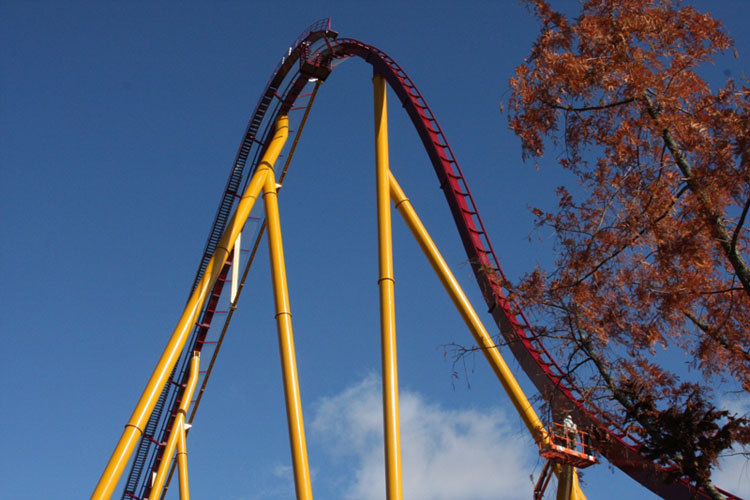
This is my latest project. I'm actually spending time on this coaster especially with the supports.

Image

Image

Image

Image

I'm looking for some ideas for some good names and color schemes.

Post April 28th, 2010, 1:53 am
stevecoaster User avatar
CoasterCrazy Media
CoasterCrazy Media

Posts: 178
Points on hand: 3,031.00 Points
Location: USA


Post April 28th, 2010, 7:00 am

Posts: 2482
Points on hand: 209.00 Points
Bank: 311.00 Points
Location: Switzerland
Graviton,black-orange/gold scheme
Newton's Appcelerator scheme like above
All RCCAs should be RMC'd. And that event shall be henceforth known as the Rollercaust.

Post April 28th, 2010, 1:58 pm

Posts: 111
Points on hand: 50.00 Points
Are you sure your your working hard on your Supports. Those supports some are Stuck out to far and then a Vertical beam down the middle isnt going to work. Really re-shape your drop it is way off after it comes off the lift it looks like thats the Highest degree and other hills go Steeper.

Heres a picture of what your drop you should look close to, its not the best angle but its the best i could find for your type of B&M.

Image

Not to be mean or anything either, just trying to give you helpful advice.

Post April 29th, 2010, 11:25 am

Posts: 91
Points on hand: 949.00 Points
Location: Lanesville, Indiana, USA

My supports were just temps when i posted the screenshots. I'm not going for true B&M style, I'm using it because the trains offer very high capacity.

Edit:

Supports are started and first color scheme and name is on the table. What you guys think of Juggernaut.?.

Image

Post April 29th, 2010, 2:05 pm
Metazoanhaddock User avatar
Moderator
Moderator

Posts: 1758
Points on hand: 3,382.00 Points
Bank: 52,337.00 Points
Location: Seattle, Washington
black and red, too generic, overdone...try looking at colors one wouldn't think of using...those always turn out interesting
Head Moderator
Director, Structural Engineer - PEAK Amusements
Site Contest Judge (Supporting)
Chatroom Admin

Post April 29th, 2010, 2:35 pm

Posts: 1928
Points on hand: 1,601.00 Points
Location: OH, USA
Can you show us a side picture of your drop? Those are always where the biggest and most glaring problems are in B&M hypers. It's as if, when B&M redesigned their drop, they said "let's see how awkward we can make this shaping so that nobody will ever be able to accurately recreate a B&M hyper ever again"...
Imagethere's a better side angle of a real B&M hypercoaster's drop.

Next thing: how many coasters have you made in NL? If you're still what most would call a n00b, I highly recommend sticking to a particular manufacturer's style. Not only do you have more references to go off of, but it also makes it easier for really experienced designers to critique it more thoroughly. With that said, "not sticking to ______'s style" is also not a valid excuse for shitty trackwork.

Post April 29th, 2010, 2:51 pm

Posts: 91
Points on hand: 949.00 Points
Location: Lanesville, Indiana, USA

I've been messing around with NoLimits for over a year now. But this is the first coaster,and my first newton coaster that I have put a lot of serious time into.

Image

Post April 29th, 2010, 3:49 pm

Posts: 111
Points on hand: 50.00 Points
Im loving your name but the color scheme im not liking, A orange and Grey scheme maybe or yellow in blue maybe. Also can we get a pic of the whole layout?

Post April 29th, 2010, 5:24 pm

Posts: 91
Points on hand: 949.00 Points
Location: Lanesville, Indiana, USA


Post April 29th, 2010, 7:24 pm

Posts: 3153
Points on hand: 2,837.21 Points
Bank: 6,969.69 Points
I like the layout from the top view a lot, but the shaping is pretty bad. Like others have suggested, try to use pictures as reference to make your shaping more like that of real B&M hypers, and the ride will turn out better.

Post April 29th, 2010, 8:05 pm

Posts: 111
Points on hand: 50.00 Points
Yes i agree Mishaped in some areas, your hills are off by alot, they are way to wide. Here is a pic of the Real shape

Image

Post April 29th, 2010, 8:08 pm
slosprint User avatar
Premium Member
Premium Member

Posts: 3649
Points on hand: 5,728.00 Points
Location: MA, USA
And the top of that first hill is way too tiny.
Boulder Dash was the only good roller coaster.

"or if you're when the hydraulic fluid was dumped out of the motor is goes 200ft up the tower and is like "LOL nope"" - CKMWM 2016

Post April 29th, 2010, 10:51 pm

Posts: 1613
Points on hand: 62.00 Points
I think that the layout is wayyyyyyyy to spread out and not tight enough to push some sort of forces. Doesn't seem like it at least. Try reshaping those hills aswell.
So, my friend came up to me the other day and asked if I wanted a frozen banana, and I said no, but I want a normal banana later, so... yea.

- RIP Mitch Hedberg

Post April 30th, 2010, 4:06 pm

Posts: 91
Points on hand: 949.00 Points
Location: Lanesville, Indiana, USA

Talk about bad luck, since my computer is throwing fits at me and the supports are about 90% done, I'm gonna upload today most likely. Will probably work on a Version 2 in the future if I can get my computer back to normal.


Return to Hard Hat Area


  • Related topics
    Replies
    Views
    Last post
cron