Been working on a B&M Inverted for a few weeks now (takes me longer because i hand build). The idea behind this ride was to create a completely original, but realistic B&M Invert that still shows hints of their style. I've used rides like the original Nemesis, Great Bear and Alpengeist to draw inspiration from as these three stand out to me as B&M Inverts that are quite different from the Batman/Raptor clones.
I started with this ride with the terrain, i spend about half an hour in the Terraformer generating terrain after terrain. Deciding on a terrain, looking through it, playing with it then revisiting the generator until i got one right. I wanted an island with a beach strip attaching it to a land mass (tombolo) but after playing around I ended up with something fully customised and quite different but still followed the original idea.
I wanted the coaster to come out of the station and drop to the sea then turn and climb a lift to the top of the island (highest point). I then wanted the ride to be quite long featuring areas of all different speeds leaving the riders in a state of constant surprise right to the end. But one key feature i want was a high speed large feature out on the water. To be the trade mark feature (if you see it you know that must be the Crimson Nightmare). Also high capacity ride times, atm i can run 4 trains at a time, each one with 10 cars, quite fluently. I had the lift slowing to a crawl just as you crest but i removed this feature because after 5mins of the system running i started having trains waiting on the lift for the train in front to clear the MCBR.
I'm going to heavily theme this ride, it will be packed with 3D's. There will be two bridges over to it and complete walks and shops etc all around the ride. I've created a large castle station including exit station, storage track, and entry station with queue and photo shop.
The theme i'm going for is Blood, Castles and hints of vampire, all dark and mysterious.
Please look at these photos and let me know if you think the tracks and supports are too close. The photos are also to see what is to come.
Pics removed to help loading
Thoughts?
Board index ‹ Roller Coaster Games ‹ Hard Hat Area ‹ Crimson Nightmare [NL B&M Inv]


haha yeah. Realized that after I posted it.
I've never really had the patience to make it look that clean.


Crimson Nightmare [NL B&M Inv]
25 posts
• Page 1 of 1
Last edited by TheArchitect on March 30th, 2011, 5:22 pm, edited 1 time in total.

The building all look to monochromatic and plain.
^Agreed
[19:34:14] RideWarriorNation: jim
[19:34:27] RideWarriorNation: can you pls change sig
[19:35:22] Jcoasters: ok
[19:35:39] RideWarriorNation: ty
[19:34:27] RideWarriorNation: can you pls change sig
[19:35:22] Jcoasters: ok
[19:35:39] RideWarriorNation: ty
yeah the textures didn't load properly because i have to chop back and forth between MAC and Windows. I make the ride in MAC but make the Objects in Windows, so when i came back to MAC a couple textures are missing so NL just replaces them with other ones (the grey brick in this instance with marble on the floor??). This will be sorted later, when track work and supporting is finished ill be finishing up on the Windows side and packing it on that side so there wont be any probs.

That would help, but everything is still boring. All it is is thick brick walls and a red roof. Nothing exciting.
[19:34:14] RideWarriorNation: jim
[19:34:27] RideWarriorNation: can you pls change sig
[19:35:22] Jcoasters: ok
[19:35:39] RideWarriorNation: ty
[19:34:27] RideWarriorNation: can you pls change sig
[19:35:22] Jcoasters: ok
[19:35:39] RideWarriorNation: ty
Alright i'll jazz it up, it is a small part of a large castle!

That brick texture on the queues in the first picture doesn't work. You have it going one way on the sides of the walls and then the other way on the top. And I agree that it is very dull looking 3d wise. I would choose a different brick texture all together that one just screams boring office building to me. Find something a little more castle"ish".
Looks to be a good start though.
Looks to be a good start though.
Oh,damn thats tasty.If it gets so good like Blood,then it`ll be really good.
All RCCAs should be RMC'd. And that event shall be henceforth known as the Rollercaust.
Oh,damn thats tasty.If it gets so good like Blood,then it`ll be really good.
All RCCAs should be RMC'd. And that event shall be henceforth known as the Rollercaust.
Facts:
9 Inversions, featuring a pretzel and two interlocking vertical loops, both break the B&M vertical loop height record.
Top speed of 75mph.
Strongest G forces at 4.5, but overall quite a forceful ride like original Nemesis. This wont be for the faint hearted.
Might upload some pics of the two Vert Loops.

instead of a brick texture what about a masonary stone type??? and instead of a red roof what about black shilling texture???
"An artist can paint a picture on a canvas, but a musician can paint a picture on silence."
^i'll post a pic showing my latest progress on the station area 3Ds. I've gone for a dark stone type with a wattle & dorb style contrast. Good idea for a roof texture, ill try it out.
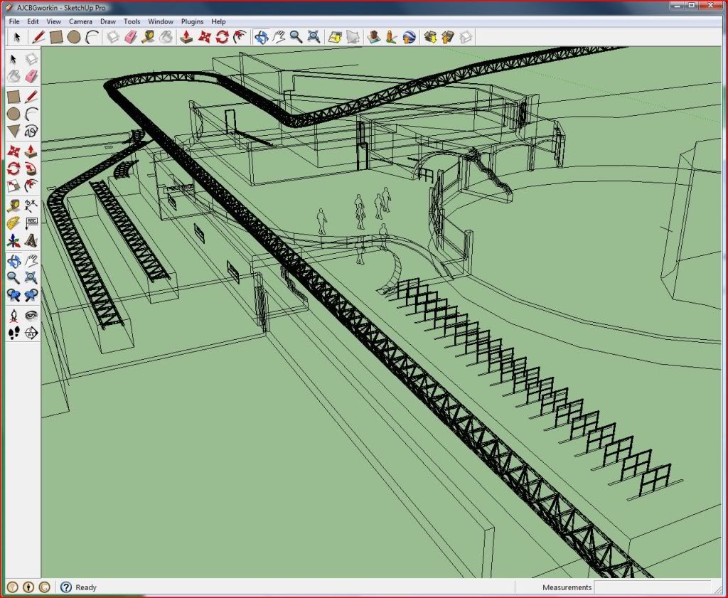
The crack through the background building is where a holding brake goes though, the turns 180' and goes into the white building. The bell tower is the entrance/exit and houses the on ride photo etc.
From the other pics i've posted already can people please let me know if the train gets too close to other track and supports? I think its within real-life tolerance.

Hmmm, how are you going to keep this from eating fps?
Originally posted by GerstlCrazy:
The more time I spend on this website adds more to the impression that this has become a daycare.
The more time I spend on this website adds more to the impression that this has become a daycare.
wow i dont think i couldve done better with the texture myself. lol. i usually dont take tyme on my 3ds. thats why most of them always turns out sqaure! lol anyways its looking really good. and the track dosnt look like it would be to close to anything
"An artist can paint a picture on a canvas, but a musician can paint a picture on silence."
I love that dark stone texture. I'm only a little jealous because I am working off-and-on on an invert that (at least in my mind) would end up looking eerily similar. Perhaps I'll hold off a while. This looks awesome.
^It is Google Sketchup
[19:34:14] RideWarriorNation: jim
[19:34:27] RideWarriorNation: can you pls change sig
[19:35:22] Jcoasters: ok
[19:35:39] RideWarriorNation: ty
[19:34:27] RideWarriorNation: can you pls change sig
[19:35:22] Jcoasters: ok
[19:35:39] RideWarriorNation: ty
Originally posted by Jcoasters
^It is Google Sketchup
^It is Google Sketchup
haha yeah. Realized that after I posted it.
I've never really had the patience to make it look that clean.
The castle looks wonderful, and the track works looks pigeon what I can see. Clearances look good too, but I'd like to see some more shots of the track work so we can give you pointers on the shaping and whatnot.
First off, thanks to everyone for the positive feedback coming so far. It's really helping me to keep going with this one and not quit before uploading (which is my usual style, i have TONS of rides that have never seen the exchange). Glad the texture issue is now history and i can move on with the rest of the ride.
As far as i'm concerned the station house is now 99% done. The ride still has the same layout set in stone but i have done serious alterations to most of the track where i made one part the first vertex, then deleted right back to the previous element, then completely re-made it. This allowed me to nail some of the speed, G, and shaping issues. I seem to over complicate my rides with almost three directional changes in one helix. Then i delete it all and make it one helix with just the one direction change.
To answer some feed back:
Well, from my experience on this website it seems that 9/10 people have pretty high end PC's and Macs. I myself have the quad core i7 iMac, and it's 100fps for me permanently. When i run the sim on the windows half on my Mac (which i only allowed 100 GB of memory for) i still run on 100fps, with millisecond dips to 80fps which restore to 100fps in a heartbeat. I figured that provided i don't see a fraction of lag or jittery frames, then everyone else will be fine.
The objects i make i always turn a circle in a hexagon, and try to keep to polygons as this allows NL to load the objects faster, as well as keeping everything as one object so that it stays in your view for longer and therefor will be loaded less often.
Here's a couple update pics:
Looking from the final brake, perspective.

An old pic to show contrast and hints of finished layout.

Cliff side of Station Castle, will be rocky-cliff-i-fied.

And some track pics, as requested.

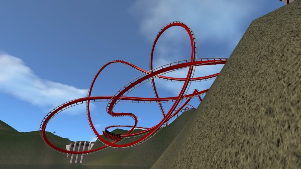
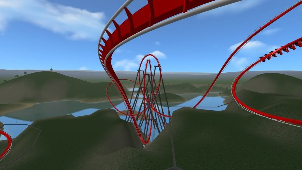
As far as i'm concerned the station house is now 99% done. The ride still has the same layout set in stone but i have done serious alterations to most of the track where i made one part the first vertex, then deleted right back to the previous element, then completely re-made it. This allowed me to nail some of the speed, G, and shaping issues. I seem to over complicate my rides with almost three directional changes in one helix. Then i delete it all and make it one helix with just the one direction change.
To answer some feed back:
Originally posted by ianko66
Hmmm, how are you going to keep this from eating fps?
Hmmm, how are you going to keep this from eating fps?
Well, from my experience on this website it seems that 9/10 people have pretty high end PC's and Macs. I myself have the quad core i7 iMac, and it's 100fps for me permanently. When i run the sim on the windows half on my Mac (which i only allowed 100 GB of memory for) i still run on 100fps, with millisecond dips to 80fps which restore to 100fps in a heartbeat. I figured that provided i don't see a fraction of lag or jittery frames, then everyone else will be fine.
The objects i make i always turn a circle in a hexagon, and try to keep to polygons as this allows NL to load the objects faster, as well as keeping everything as one object so that it stays in your view for longer and therefor will be loaded less often.
Here's a couple update pics:
Looking from the final brake, perspective.

An old pic to show contrast and hints of finished layout.

Cliff side of Station Castle, will be rocky-cliff-i-fied.

And some track pics, as requested.


Do you AHG it?
^ Not literally with the AHG tool, but i do my own heart lining by hand.

So AHG some of it and hand smooth the heartline with the auto smoother?
I love your pre drop[approve]
EDIT: ^He didn't use AHG. He just heartlined as best he could by handbuilding.
EDIT: ^He didn't use AHG. He just heartlined as best he could by handbuilding.
The combination of the terrain and 3ds really makes it stand out! Looks great! Also, I'm definitely liking the barrel roll before the lift. Looks very well executed. Not sure I'm a fan of the interlocking loops, as they seem too big, tbh. maybe they're not quite shaped right?
The shaping of the loops was a long and arduous job. On the first (taller) loop the exit is 20ft lower, and therefor looks like the loop is leaning backward, but it isn't. The second loop starts lower down and looks smaller, but it is actually 10ft bigger.
Loop 1: 155ft tall and the highest point is 185ft off ground zero.
Loop 2: 160ft tall with the highest point 170ft off ground zero.
They are normal-shaped B&M invert loops, with the classic shape, but have had to fit in very specific places.
ill get some editor pics of the loops up soon.
[edit]
Well here are the loops in designers eye.
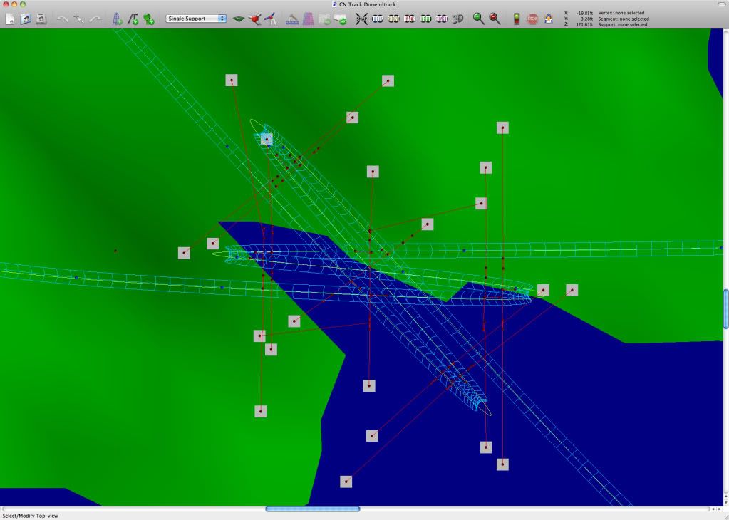
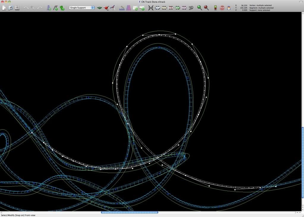
Loop 1: 155ft tall and the highest point is 185ft off ground zero.
Loop 2: 160ft tall with the highest point 170ft off ground zero.
They are normal-shaped B&M invert loops, with the classic shape, but have had to fit in very specific places.
ill get some editor pics of the loops up soon.
[edit]
Originally posted by boneplaya
but I'd like to see some more shots of the track work so we can give you pointers on the shaping and whatnot.
but I'd like to see some more shots of the track work so we can give you pointers on the shaping and whatnot.
Well here are the loops in designers eye.


25 posts
• Page 1 of 1
-
- Related topics
- Replies
- Views
- Last post
-
- Welcome To Your Worst Nightmare
by Thelimitsfreak » September 9th, 2007, 6:37 am - 1 Replies
- 597 Views
- Last post by Tetsu

September 9th, 2007, 8:11 am
- Welcome To Your Worst Nightmare
-
- Looking For Helpers For Nightmare!
by Thelimitsfreak » September 28th, 2007, 2:59 am - 4 Replies
- 828 Views
- Last post by obscene_pirate

September 28th, 2007, 3:13 pm
- Looking For Helpers For Nightmare!
-
- Janus - Thrill can be a two-faced nightmare!
by Tidus » July 18th, 2009, 11:45 am - 10 Replies
- 1146 Views
- Last post by Tidus

July 21st, 2009, 12:05 pm
- Janus - Thrill can be a two-faced nightmare!


