Board index Roller Coaster Games Hard Hat Area Carcajou - B&M Invert

Carcajou - B&M Invert

The Hard Hat Area is the place to post construction news about your ride, so this is the place to hype your future upload!

Post May 4th, 2011, 1:41 am

Posts: 357
Points on hand: 935.00 Points
Image
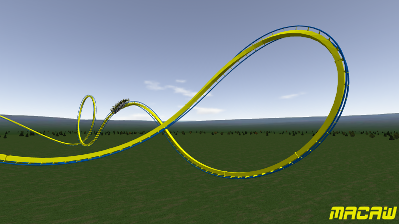
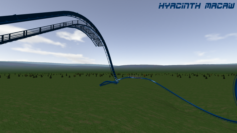
I started work on this a little bit ago and I figured it was time to post some progress here. Here's Macaw, a ~125ft tall invert. However, its going to be heavily terrained. Here's a glimpse of it.
Last edited by raptorTC on September 8th, 2011, 1:12 am, edited 1 time in total.

Post May 4th, 2011, 2:43 am

Posts: 1928
Points on hand: 1,601.00 Points
Location: OH, USA
Looks beautiful. Can't stand the colors, though [;)]. Hope the shaping is ok, though, because the 0-g roll and the loop look sort of awkward at the moment. It's probably just the angle, but I figured I'd mention it just in case.

Post May 4th, 2011, 8:00 am

Posts: 1241
Points on hand: 95.00 Points
Bank: 2,503.00 Points
Location: Kentucky
Yeah, try inverting the colors (blue with yellow rails) or something along the lines of that.

Post May 5th, 2011, 6:25 pm

Posts: 357
Points on hand: 935.00 Points

Post May 5th, 2011, 6:53 pm

Posts: 1928
Points on hand: 1,601.00 Points
Location: OH, USA
Still don't like them...they remind me too much of....a certain school [:P]

But in all seriousness, it does look very nice with the blue spine as opposed to the yellow. But, maybe a more golden color for the rails so that it's not so bright?

Post May 5th, 2011, 7:07 pm

Posts: 1241
Points on hand: 95.00 Points
Bank: 2,503.00 Points
Location: Kentucky
How about a completely gold or yellow track with blue supports (or invert that)?

While what you have looks better, it's still kind-of fake looking.

Post May 5th, 2011, 8:34 pm

Posts: 357
Points on hand: 935.00 Points
Image

I've always liked this color, but I feel like I'm stealing the color from bob 3 since he just threw it on his floorless. And I'm not really a fan of the gold, but I could make it work with these color supports I guess. Of course, I'll probably change my mind on colors a few more times before I upload anyway.

Post May 5th, 2011, 8:38 pm
Turbo User avatar
Moderator
Moderator

Posts: 3771
Points on hand: 5,516.00 Points
Bank: 21,857.68 Points
Location: WA, USA

awww dammit, you beat me to it, i was making an invert with that exact layout from the lift until after the first loop
Coaster Count: 582 // Top Five: 1. Helix 2. Nemesis 3. Big Bad Wolf 4. Boulder Dash 5. Balder

Coasterkidmwm wrote:
4 G's to the taint was a bit much for me because I'm not a power bottom like Turbo

Post May 5th, 2011, 11:56 pm

Posts: 2252
Points on hand: 5,889.00 Points
Location: Illinois (SFGAm), USA
no, do the blue and yellow, it looks so much cooler! The dark blue looks too much like Alios....
American Eagle Lover

Post May 6th, 2011, 12:18 am

Posts: 510
Points on hand: 1,385.00 Points
Due a three-color paint job. Blue spine and rails, yellow ties, and red supports. This will be best for theming purposes. http://en.wikipedia.org/wiki/Scarlet_Macaw
Originally posted by dcs221
\n"they see me trollin', they hatin'..." -Omnigeek6

Chamillionaire you are not...but white and nerdy, yes.

Post May 6th, 2011, 1:03 am

Posts: 2252
Points on hand: 5,889.00 Points
Location: Illinois (SFGAm), USA

Post May 6th, 2011, 7:41 am

Posts: 1241
Points on hand: 95.00 Points
Bank: 2,503.00 Points
Location: Kentucky
I think if you do yellow supports (in a way, make it look similar to Goliath @ SFFT), and then make the train red, it might work. Yellow ties I think would look odd, but a completely blue track and yellow supports with a red train may get the job done.

If all else fails, go for the Blue-and-Yellow Macaw. It has teal, gold, and touches of green, which might work out better than the three primary colors.

Post May 7th, 2011, 12:59 am

Posts: 31
Points on hand: 903.00 Points
Location: USA
I made an example scheme for you. This is one of my suggestions:

Image

I know, it would be very time consuming, but I'm just throwing it out there.

Post May 7th, 2011, 1:13 am

Posts: 2914
Points on hand: 5,657.00 Points
Bank: 0.00 Points
It would looks good if you had the time, but I don't think it would be very practical in real life.
[19:34:14] RideWarriorNation: jim
[19:34:27] RideWarriorNation: can you pls change sig
[19:35:22] Jcoasters: ok
[19:35:39] RideWarriorNation: ty

Post May 7th, 2011, 1:20 am

Posts: 3153
Points on hand: 2,837.21 Points
Bank: 6,969.69 Points
A couple coasters have supports like that. There's a relatively new SLC with a similar scheme.

Post May 7th, 2011, 10:52 am

Posts: 1241
Points on hand: 95.00 Points
Bank: 2,503.00 Points
Location: Kentucky
^Oh yeah, I remember Firewhip!

Well, if you wanna take the time for it, I'd go for it! It's certainly an interesting color scheme.

Post May 7th, 2011, 11:09 am
gouldy User avatar
Premium Member
Premium Member

Posts: 7827
Points on hand: 3,639.00 Points
Bank: 25,088.00 Points
Location: WOLVERHAMPTON, England.

Originally posted by Jcoasters

It would looks good if you had the time, but I don't think it would be very practical in real life.


What do you mean, not practical in real life?

How do you mean? In reality it's just a paint scheme, and you can paint things as many different colours as you like. If it's "not practical" in any situation, it's in NoLimits, where you have to make separate segments. As I found out when I made Tsar, which has two colours on every support. But that was only 2 colours, what TyroneCoasters has shown has many colours so it would take a while that's for sure. Would be cool though... although perhaps not with those colours! [lol]

Post May 7th, 2011, 11:09 am

Posts: 6183
Points on hand: 483.00 Points
Bank: 19,590.00 Points

Post May 7th, 2011, 2:24 pm

Posts: 1928
Points on hand: 1,601.00 Points
Location: OH, USA
Try doing the supports in 3ds? Then it'll be really easy lol.

Post May 7th, 2011, 2:35 pm

Posts: 31
Points on hand: 903.00 Points
Location: USA
Yeah, supports like that are very time consuming. But, I have a few more easily made themes to show you. Sadly, my screenshots aren't exporting to the right place anymore for some reason and I can't find them. As soon as I fix this, I will show you.

NOTE: I was never good at making colors look appealing together. That goes for the clothes I wear, too. Most of them are just black and white Tshirts that cut the sleeves off of.
Peace in, War out.

Post May 7th, 2011, 2:45 pm

Posts: 1241
Points on hand: 95.00 Points
Bank: 2,503.00 Points
Location: Kentucky
^Compatibility Files, my brother.

Anyone remember that post I made about the CompFiles and how I said I did it daily? Another example! [:P]

- Justin "Where Windows Vista and 7 FAIL" Clarke

Post May 7th, 2011, 3:22 pm
gouldy User avatar
Premium Member
Premium Member

Posts: 7827
Points on hand: 3,639.00 Points
Bank: 25,088.00 Points
Location: WOLVERHAMPTON, England.

I hate compatibilty files. What the hell is even the point?

"Hey I know, to help you, I'm just going to only show half of the images in this folder for no real reason whatsoever - unless that is you press the compatibility files button (which doesn't exist in some folders)"

The other day I downloaded a file with about 2 thousand images in it (in winzip I could see the images), then I unzipped it to a folder on the desktop. Then when I went to the folder, it was still 400mb in size, but you open it up and... nothing. I'm like.... ok... oh yeah, I remember, Compatibility files! I'll just cli.... WHAT!? NO COMPATIBILITY FILES BUTTON!?

The files aren't "hidden" in the properties or anything, you just cannot see them and there is no compatibilty files button. Tried moving them to a folder that has the button in it, but you can't move the individual files because you can't see them - however, move the folder into the other folder, and then go into the folder, there's still no button, so...

love it. Stupid love operating system. Gonna switch all my images and stuff over to my Ubuntu and keep all the programs and such on the Windows OS.

Post May 8th, 2011, 4:27 pm

Posts: 357
Points on hand: 935.00 Points
Yeah, compatibility files blow.

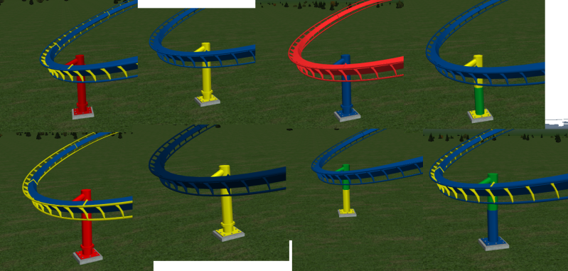
On another note, I threw together some schemes.
Image

If you can think of more or have a favorite let me know. Worst comes to worst its going to be dark blue track with yellow supports and black trains and I'm going to say its the Hyacinth Macaw. http://en.wikipedia.org/wiki/Hyacinth_Macaw

Post May 8th, 2011, 4:39 pm

Posts: 1928
Points on hand: 1,601.00 Points
Location: OH, USA
I think getting some red in there would be very beneficial, but I'm honestly not a fan of any of those color schemes [lol]. However, I don't have any alternatives, unfortunately. But at this point, the least of your worries is the color scheme. Focus more on the trackwork until the layout is done, then we can talk colors [;)] Sorry I brought it up i my first post. I was referring to the fact that it was blue and yellow, and I go to Ohio State. It was more of a joke meant for Tyler than a serious comment.

Post May 8th, 2011, 6:12 pm

Posts: 357
Points on hand: 935.00 Points
Haha, I knew you were just messing with me for it being too "maize and blue", but the discussion kinda blew up so I figured I'd run with it. I don't really care for the multi-colored schemes either, so for now its going to just be dark blue and yellow.
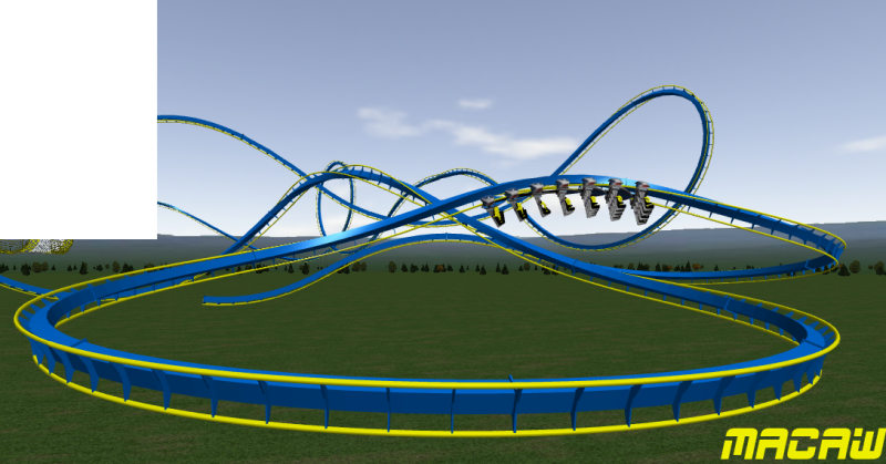
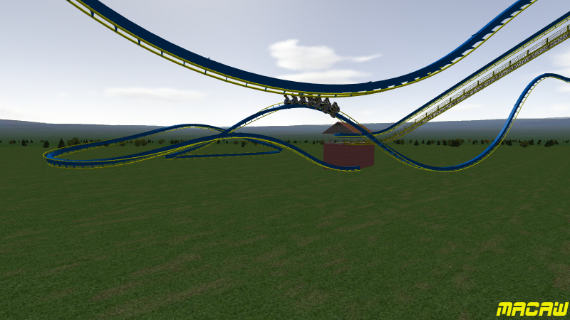
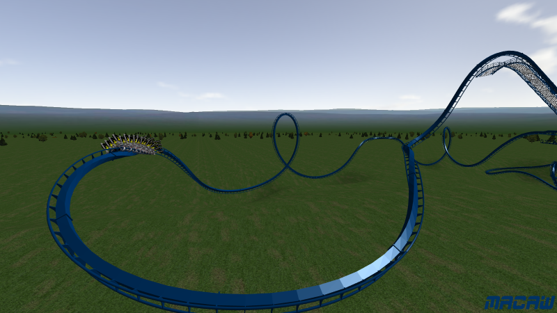
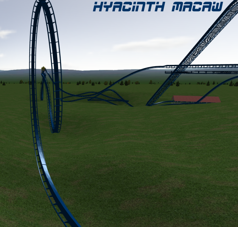
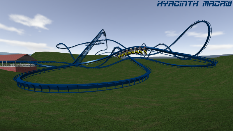
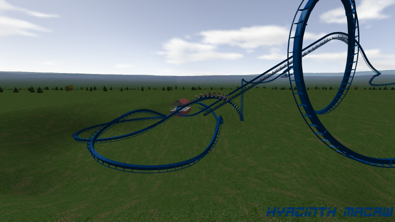
I've had the layout completed for a bit now as well.
Image

Image

Image

Image

Next

Return to Hard Hat Area


  • Related topics
    Replies
    Views
    Last post
cron