Board index ‹ Roller Coaster Games ‹ Hard Hat Area ‹ Carcajou - B&M Invert

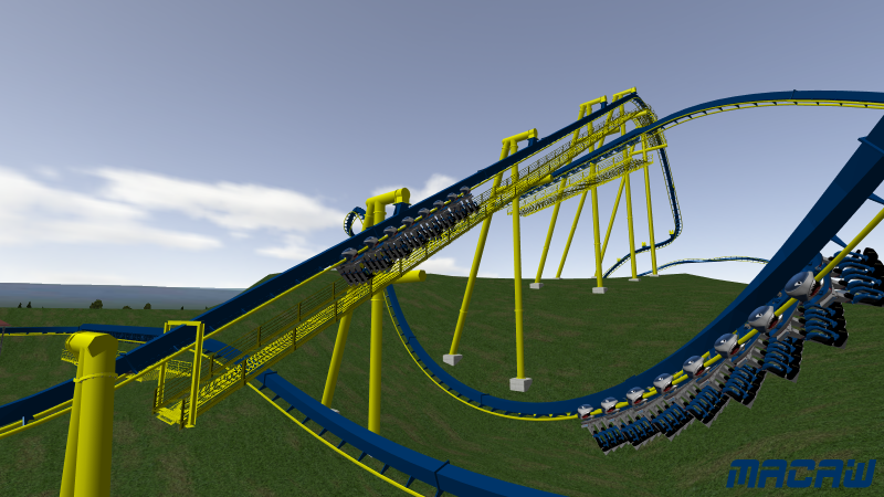
Colors are still being messed with. Lift supports done though.
It's sexyfied anyway.
But the coaster looks out of the norm, I like it!
[lol]
Carcajou - B&M Invert
51 posts
• Page 2 of 3 • 1, 2, 3
Wo! Something completely original yet still B&M-ish. With some decent themeing you could really pull off something special here. I obviously don't have a clue at how good the track work is, but i'm liking where you're going with this.

That looks really nice! And about the colors, I really love the 4th and 7th color schemes. You don't have to have red to make it a macaw-themed ride.
I think if you try to add in any red you'll get a kiddie-style, primary colors look, which is bad. It's like those ceiling fans you can get with four blades that are colored in red, yellow, blue, and green. That shouldn't go on a B&M inverted coaster.
I think if you try to add in any red you'll get a kiddie-style, primary colors look, which is bad. It's like those ceiling fans you can get with four blades that are colored in red, yellow, blue, and green. That shouldn't go on a B&M inverted coaster.
Me likes it! Looks very good! I also agree with boneplaya that you shouldn't worry about colours atm. But when it does come down to it, don't combine all those colours on the supports, save them for the train. And to answer your question I feel that the dark blue track, and yellow supports looked good.
Supports are underway.

Oh, and 3d connectors/flanges/supports made by L Bosch, retextured by me.

Oh, and 3d connectors/flanges/supports made by L Bosch, retextured by me.
Looks really nice.
RIP
Log Jammer, SFMM
1971-2011
Log Jammer, SFMM
1971-2011
Originally posted by richie5126
T: all newtons on this site are smooth so this must be high.
T: all newtons on this site are smooth so this must be high.
The layout looks really good and very different from the normal B&M style. I really like the color scheme and the very unique pre-lift.
"if you found your laughin' place, how come you ain't laughin'."https://www.facebook.com/calicoaster1/
poop, how are you doing the support connections?!
American Eagle Lover
Layout's looking fantastic. Still can't get past those colors, though [;)] I suppose I shouldn't mention it, though...given what happened last time...
But all in all, I'm definitely looking forward to downloading and riding this thing! I always enjoy your creations, and this looks like it might be your best one yet!
But all in all, I'm definitely looking forward to downloading and riding this thing! I always enjoy your creations, and this looks like it might be your best one yet!
Those are some really nice looking supports!
He uses 3ds.
People like real have been doing that for half a decade.
People like real have been doing that for half a decade.
"Careful man, there's a beverage here!"
You've got abit flange happy on those supports. Look at some pictures of real rides before you go absolutely mental with them!
I'm still a fan of the green/yellow supports (from top-bottom), but let's not worry about the colors right now haha. Looks good to me so far, but yes, you have too many flanges.

Colors are still being messed with. Lift supports done though.
To quote Ke$ha, it's "looking sick and sexy fine."
Don't know why that song's stuck in my head, but it is. Other than that, the one thing I always notice about inverts is their lift catwalk supports made out of L-beams. There's always the awkward joint, even when the rest of the supports are flawless. I say mess with that until you get something without the gap. Also, I'd add some horizontal bracing to your taller supports - they look sort of toothpicky as it stands right now.
Don't know why that song's stuck in my head, but it is. Other than that, the one thing I always notice about inverts is their lift catwalk supports made out of L-beams. There's always the awkward joint, even when the rest of the supports are flawless. I say mess with that until you get something without the gap. Also, I'd add some horizontal bracing to your taller supports - they look sort of toothpicky as it stands right now.
Don't ever quote that bitch. "It" makes you dumber.
Why do you have the offset lift supports when you're not avoiding any hazards?
Why do you have the offset lift supports when you're not avoiding any hazards?
"Careful man, there's a beverage here!"
This thing isn't dead quite yet. Supporting is just dragging on forever becuase I'm slow. And it underwent a name change.
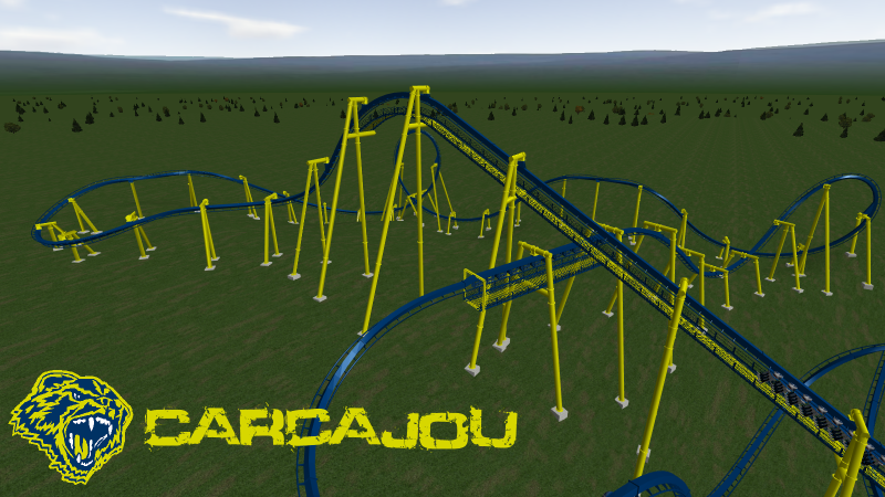
Also, the middle of the catwalk will be made blue after I finish supports.
After looking at this picture I just noticed that the supports at the top of the lift look really meh without some lateral bracing. So that will be added.

Also, the middle of the catwalk will be made blue after I finish supports.
After looking at this picture I just noticed that the supports at the top of the lift look really meh without some lateral bracing. So that will be added.
Use the 3rd track color scheme you pictured in that 8-scheme pic, or the 5th. What you have now looks awful with those supports.
Originally posted by boneplaya
To quote Ke$ha, it's "looking sick and sexy fine."
To quote Ke$ha, it's "looking sick and sexy fine."
It's sexyfied anyway.
But the coaster looks out of the norm, I like it!
Keep the Maize and Blue please, gotta give respect where it is due! I like the looks of this thing, shaping seems good and it's a really unique layout/sequence of elements. Also after a quick translation, nice name. Maybe a night environment for this weeks game?
Originally posted by Coasterkidmwm
Don't ever quote that bitch. "It" makes you dumber.
Why do you have the offset lift supports when you're not avoiding any hazards?
Don't ever quote that bitch. "It" makes you dumber.
Why do you have the offset lift supports when you're not avoiding any hazards?
Colors are staying.
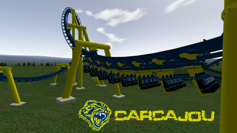
First try at a car texture. Suggestions to make it better?

First try at a car texture. Suggestions to make it better?
^I would just say that there should be more contrast with the track/supports. Too much blue and yellow for my taste. Lots of Asterix inspired niceness going on here, but I must admit I loathe the absence of both predrop AND prelift. We could all see the omission of predrops becoming more standard...but I sincerely doubt you'd ever find a prelift absent from a real-world design.
Considering the namesake, the color scheme makes sense and I like the way the trains blend, nice touch. Go UofM
"if you found your laughin' place, how come you ain't laughin'."https://www.facebook.com/calicoaster1/
Supports are done:
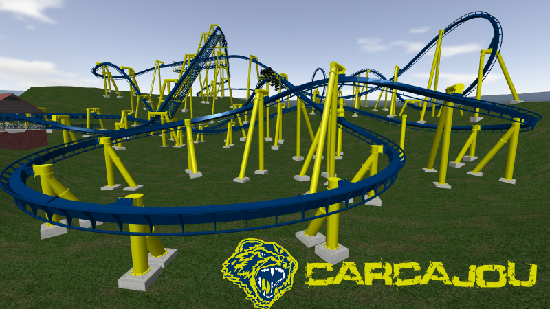
Next up is theming. Ideally I'd like to give it a theme much like Untamed at Canobie. However, my 3ds skills are rudimentary at best so it will probably take me a while to get there.

Next up is theming. Ideally I'd like to give it a theme much like Untamed at Canobie. However, my 3ds skills are rudimentary at best so it will probably take me a while to get there.
51 posts
• Page 2 of 3 • 1, 2, 3
-
- Related topics
- Replies
- Views
- Last post
-
- invert.a
by craigster001 » May 20th, 2011, 4:48 pm - 2 Replies
- 1232 Views
- Last post by craigster001

May 22nd, 2011, 2:15 am
- invert.a
-
- New B & M invert
by Bottom_Feeder_13 » August 19th, 2011, 11:54 am - 4 Replies
- 1482 Views
- Last post by Bottom_Feeder_13

August 21st, 2011, 7:42 pm
- New B & M invert
-
- B&M Invert - With Pics
by Dragon Fly » November 18th, 2005, 10:17 pm - 19 Replies
- 2888 Views
- Last post by Jakizle

February 14th, 2006, 9:54 pm
- B&M Invert - With Pics
-
- traveling invert
by gazag » October 1st, 2006, 10:54 am - 3 Replies
- 971 Views
- Last post by gazag

October 1st, 2006, 11:21 am
- traveling invert
-
- Naiad - B&M Invert
by jpecool » October 7th, 2007, 2:56 pm - 21 Replies
- 3123 Views
- Last post by CCJared101

November 9th, 2007, 3:47 pm
- Naiad - B&M Invert


