Board index Roller Coaster Games Hard Hat Area Strobe - IntaHyper

Strobe - IntaHyper

The Hard Hat Area is the place to post construction news about your ride, so this is the place to hype your future upload!

Post May 16th, 2011, 10:46 pm

Posts: 325
Points on hand: 3,123.00 Points
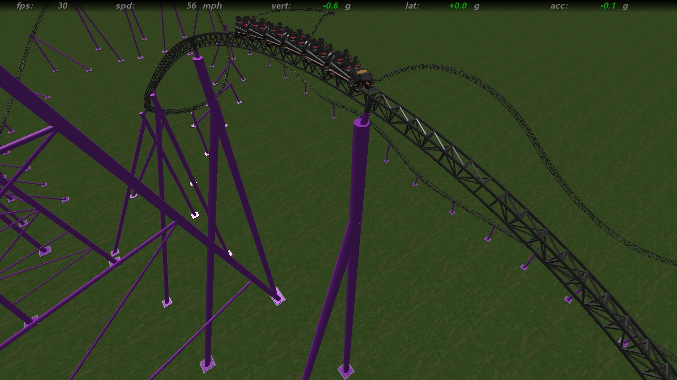
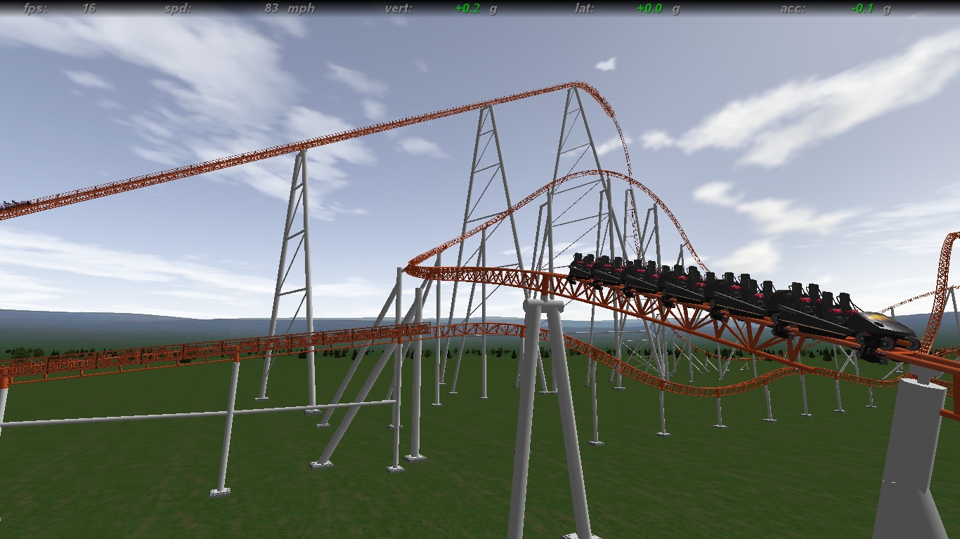
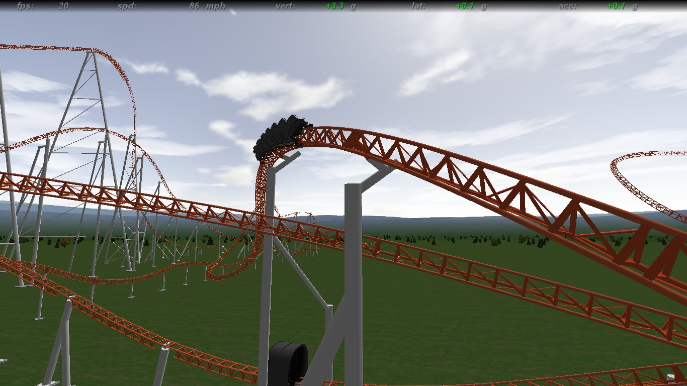
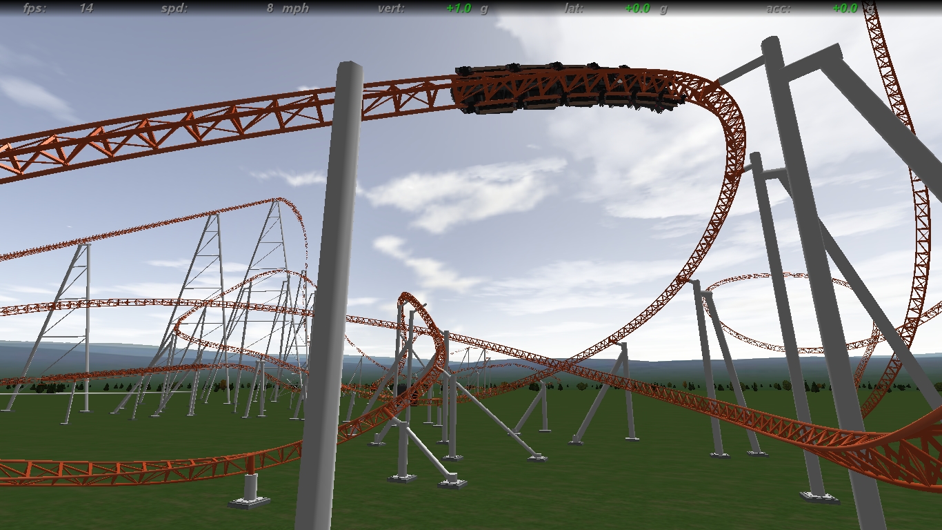
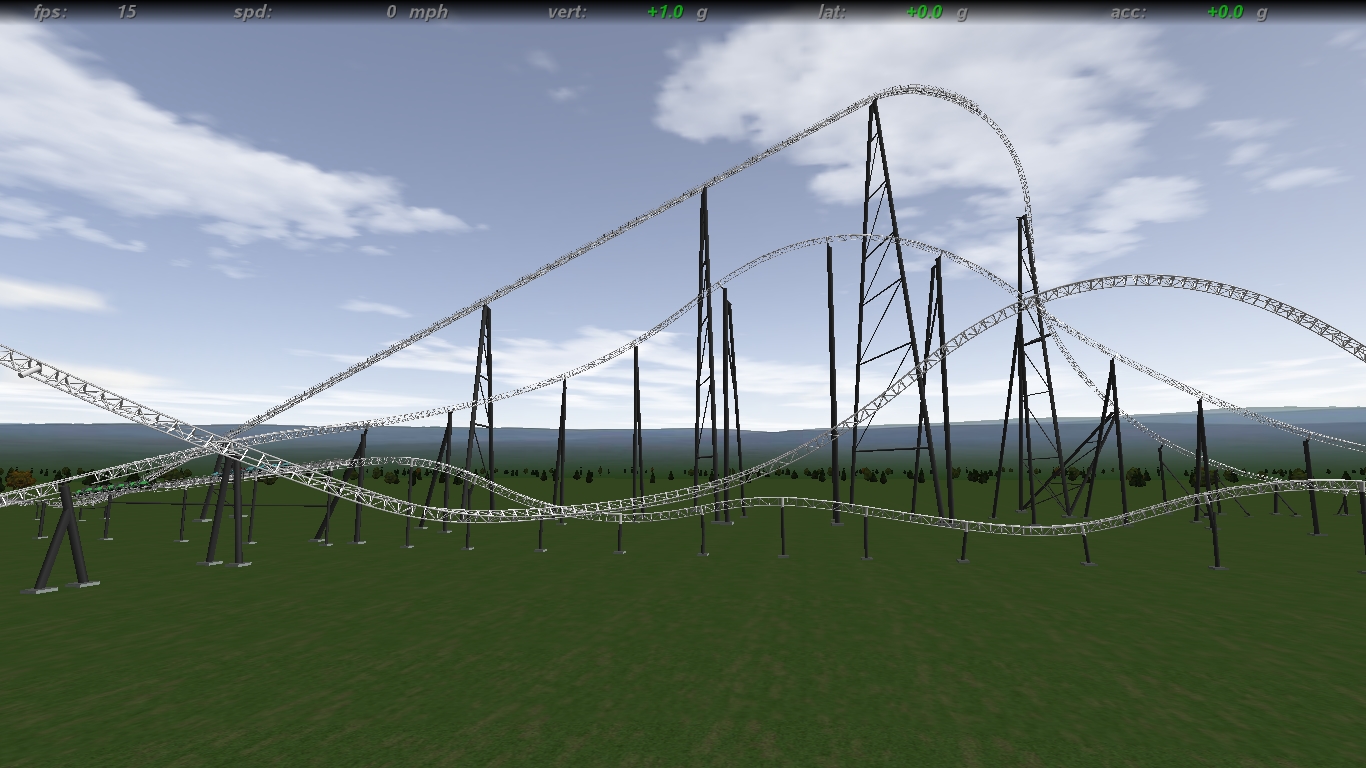
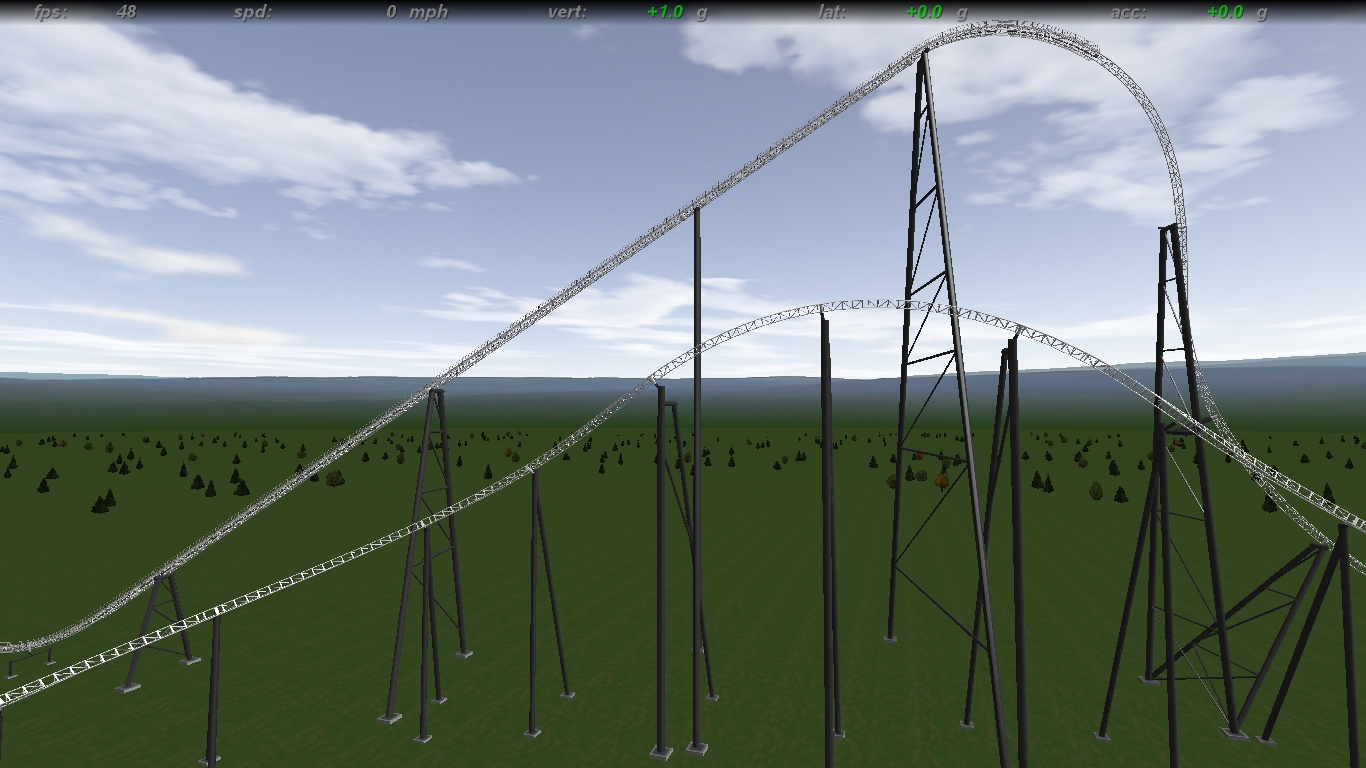
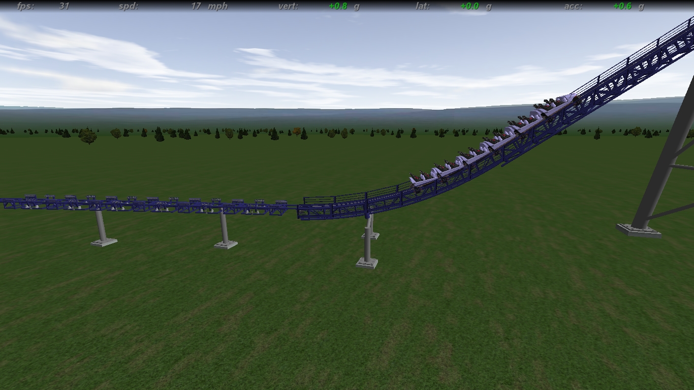
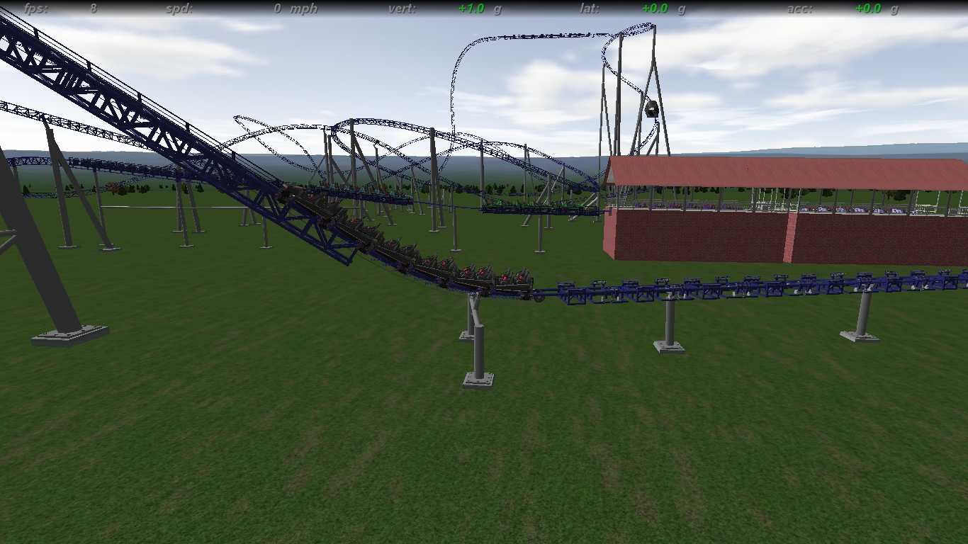
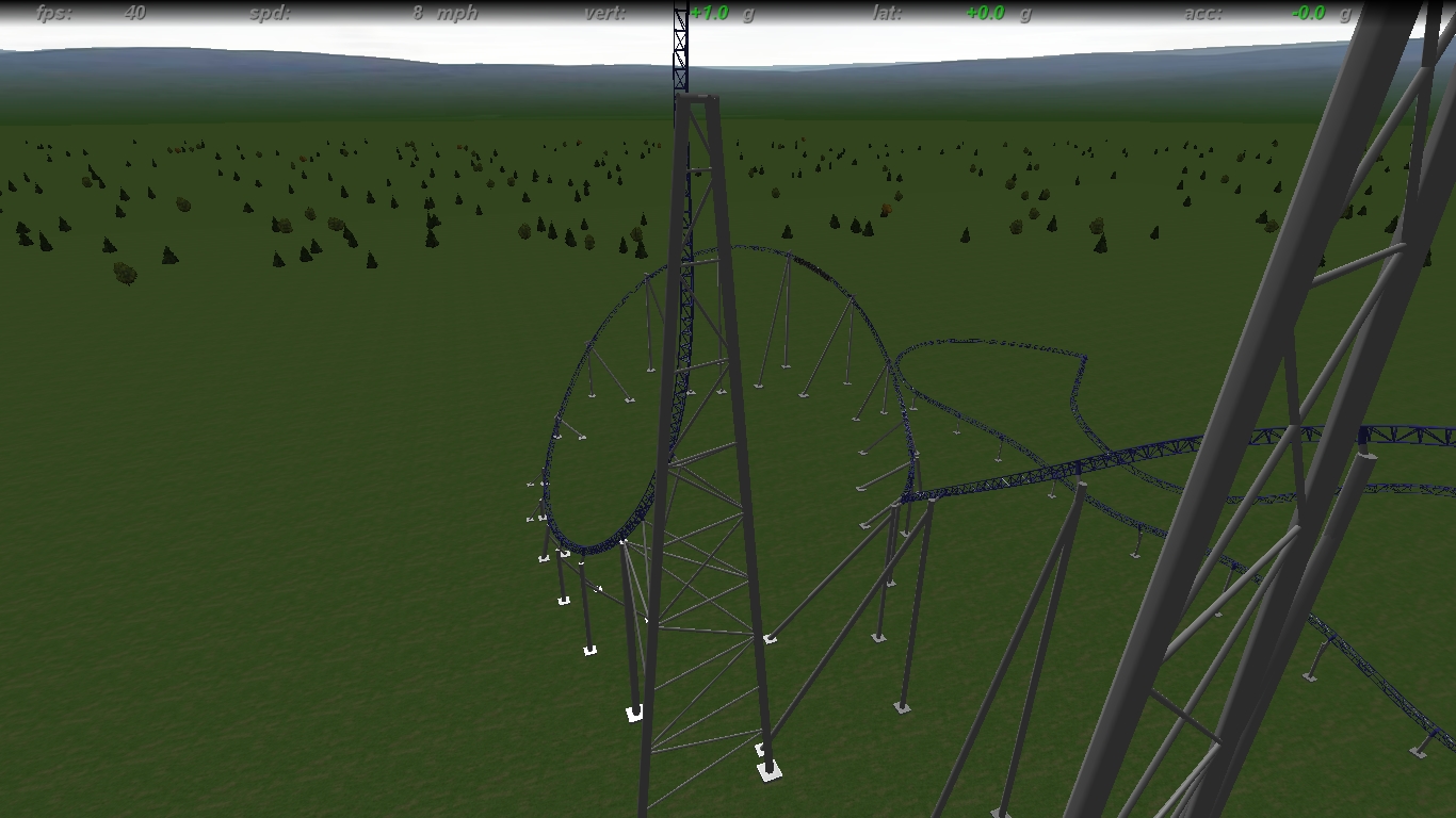
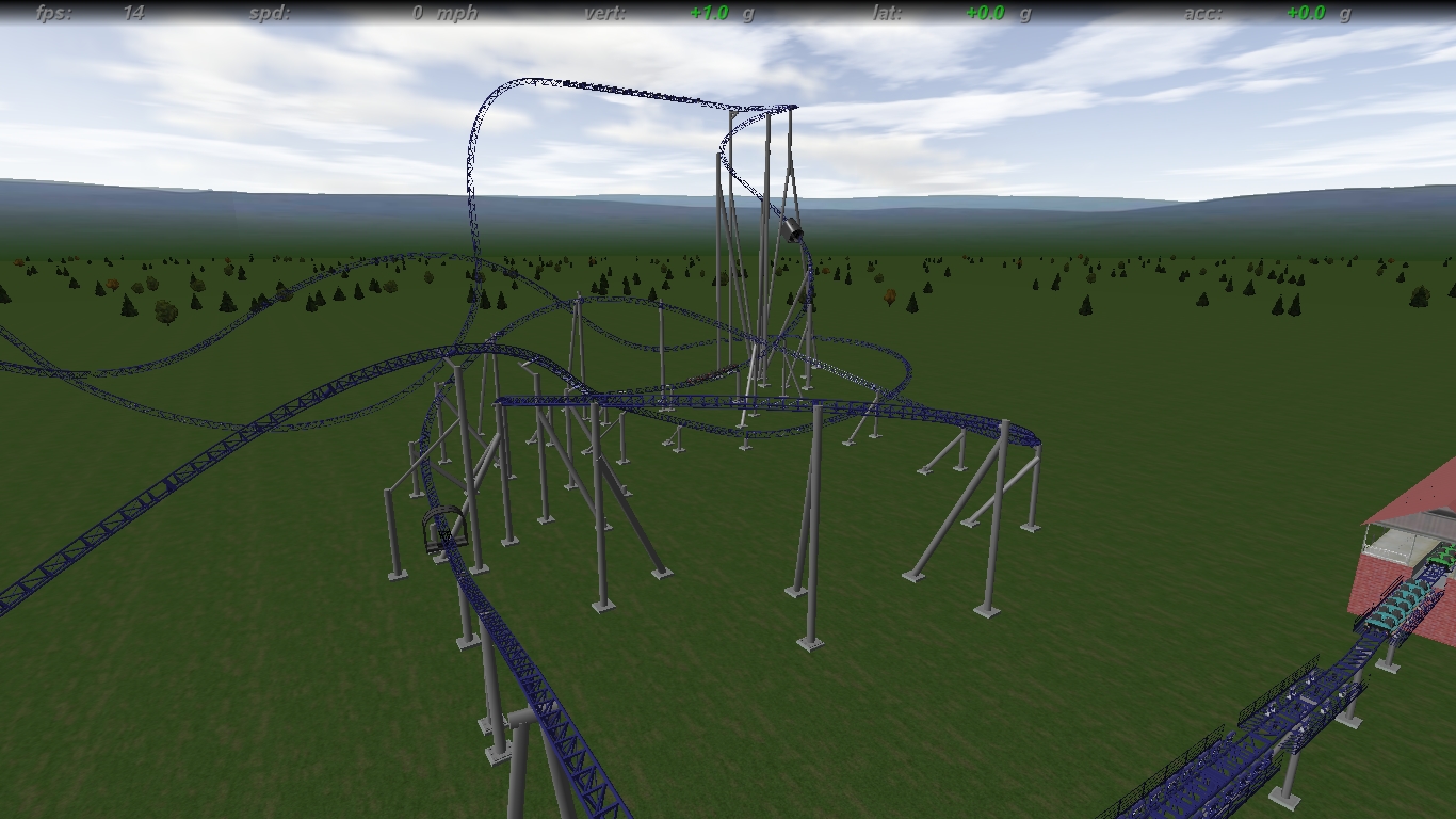
New hyped up hyper filled with air pops and adrenaline gushing elements.


Image Insert:
Image
569.37 KB


Image Insert:
Image
614.12 KB


Image Insert:
Image
647.91 KB

I'm still figuring colors out and a theme, and all supports n stuff will be CK'd at the end for square supports and updated track. Also, I understand some of the supports in pics 2 and 3 are real flimsy looking, so I'm fixing that now.
Addio, more pics soon
Last edited by strata force on May 16th, 2011, 10:47 pm, edited 1 time in total.

Post May 17th, 2011, 12:14 am

Posts: 2914
Points on hand: 5,657.00 Points
Bank: 0.00 Points
The lift is not steep enough.
[19:34:14] RideWarriorNation: jim
[19:34:27] RideWarriorNation: can you pls change sig
[19:35:22] Jcoasters: ok
[19:35:39] RideWarriorNation: ty

Post May 17th, 2011, 12:21 am

Posts: 325
Points on hand: 3,123.00 Points
25 degrees; what steepness do you suggest?

meow:
Image Insert:
Image
531.19 KB

Post May 17th, 2011, 12:25 am

Posts: 2914
Points on hand: 5,657.00 Points
Bank: 0.00 Points
35 - 40
[19:34:14] RideWarriorNation: jim
[19:34:27] RideWarriorNation: can you pls change sig
[19:35:22] Jcoasters: ok
[19:35:39] RideWarriorNation: ty

Post May 17th, 2011, 12:28 am

Posts: 325
Points on hand: 3,123.00 Points
I'll adjust that too; closer to 40 looks right after looking at i305--whoooops

Post May 17th, 2011, 12:30 am

Posts: 2914
Points on hand: 5,657.00 Points
Bank: 0.00 Points
I305 is 45 degrees
[19:34:14] RideWarriorNation: jim
[19:34:27] RideWarriorNation: can you pls change sig
[19:35:22] Jcoasters: ok
[19:35:39] RideWarriorNation: ty

Post May 17th, 2011, 12:45 am

Posts: 325
Points on hand: 3,123.00 Points

Post May 17th, 2011, 12:54 am

Posts: 2914
Points on hand: 5,657.00 Points
Bank: 0.00 Points
The pull up into the lift is too big.
[19:34:14] RideWarriorNation: jim
[19:34:27] RideWarriorNation: can you pls change sig
[19:35:22] Jcoasters: ok
[19:35:39] RideWarriorNation: ty

Post May 17th, 2011, 2:17 am

Posts: 1928
Points on hand: 1,601.00 Points
Location: OH, USA
Wow. Let's mention one thing at a time and see how many pages it takes before he get fed up and kills all of us.

But in all seriousness, this looks way too newtony for an Intamin. Pay closer attention to detail in your forces and shaping to make it less obviously newton. And get rid of the beyond-vertical drop. I can't put my finger on why, but I absolutely HATE that shape on large rides. I think it's ugly. Sure, it'd be fun, but it's not pretty to look at (go ahead, flame: I put aesthetics at a high priority). That's why I'd rather sit and start at millennium force than ride it most of the time.

Next: supports. They're not looking so hot, especially on your drop pullup. That slanted poop has got to go. The airtime hill right in front of it's even worse though. How did you even manage such an awful support design? Not only is it ugly, but it looks like it'd fall over every time the train came flying its way! (ok, only the first time, but that's a technicality [;)])

Ok...now that that's out of the way, I can comment on the fact that I like your white/purple color scheme. Now that you've made something like this, I'm thinking I need to do something similar, though maybe on a different scale...also, your layout looks like a lot of fun - so keep that - just un-newtonize it, yeah?

Post May 17th, 2011, 3:08 am

Posts: 325
Points on hand: 3,123.00 Points
Originally posted by boneplaya

Wow. Let's mention one thing at a time and see how many pages it takes before he get fed up and kills all of us.

But in all seriousness, this looks way too newtony for an Intamin. Pay closer attention to detail in your forces and shaping to make it less obviously newton. And get rid of the beyond-vertical drop. I can't put my finger on why, but I absolutely HATE that shape on large rides. I think it's ugly. Sure, it'd be fun, but it's not pretty to look at (go ahead, flame: I put aesthetics at a high priority). That's why I'd rather sit and start at millennium force than ride it most of the time.


The drop has grown on me, and on a personal level, I love the feel and thrill of g's so I tried to get the best of both here. It looks neat from certain angles, but yeah a little ugly from others. But in my eyes, the G's make up for it.

Originally posted by boneplaya
Next: supports. They're not looking so hot, especially on your drop pullup. That slanted poop has got to go. The airtime hill right in front of it's even worse though. How did you even manage such an awful support design? Not only is it ugly, but it looks like it'd fall over every time the train came flying its way! (ok, only the first time, but that's a technicality [;)])


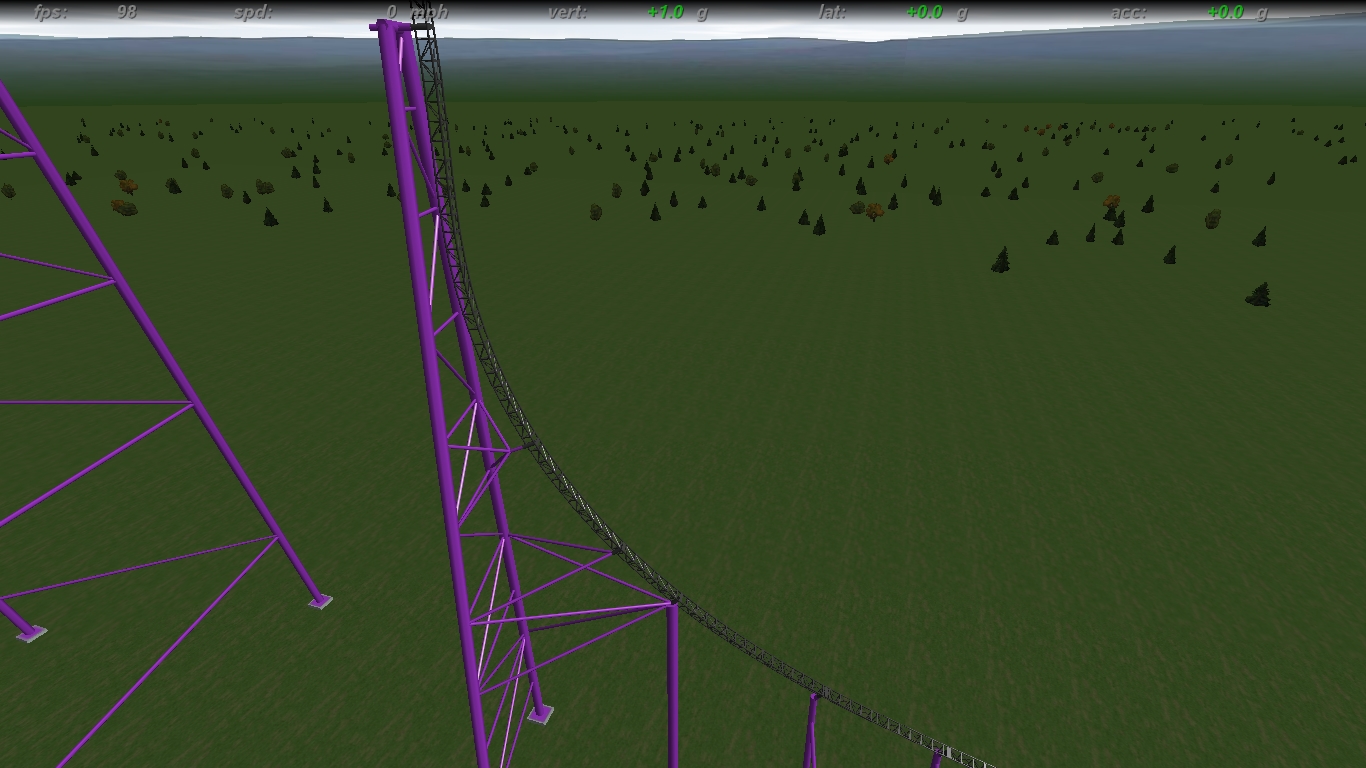
I dunno what the hell I was doing for the lift spr0tz. I started by fixing the drop structure and tried to mimic i305's style. Remember, all supports will be square-ized in the end and will be designed to work like the new style supports. Same goes for airhill. I redid them in anticipation of square supports.
Image Insert:
Image
520.55 KB

Image Insert:
Image
718.51 KB


Originally posted by boneplaya
Ok...now that that's out of the way, I can comment on the fact that I like your white/purple color scheme. Now that you've made something like this, I'm thinking I need to do something similar, though maybe on a different scale...also, your layout looks like a lot of fun - so keep that - just un-newtonize it, yeah?


I luff using purple on intamins, feels classy and velvety. But uh, on those other screens, it was white and dark gray.

Mind pointing out the super-newtoned spots? I guess, unfortunately, that this has been my smoothest newton I've put a good amount of work into. Maybe wait until the end to judge completely how newtony it was after riding or something, i duno lol.


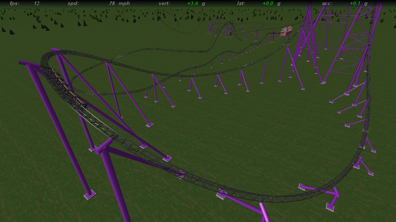
Image Insert:
Image
680.42 KB
first turn

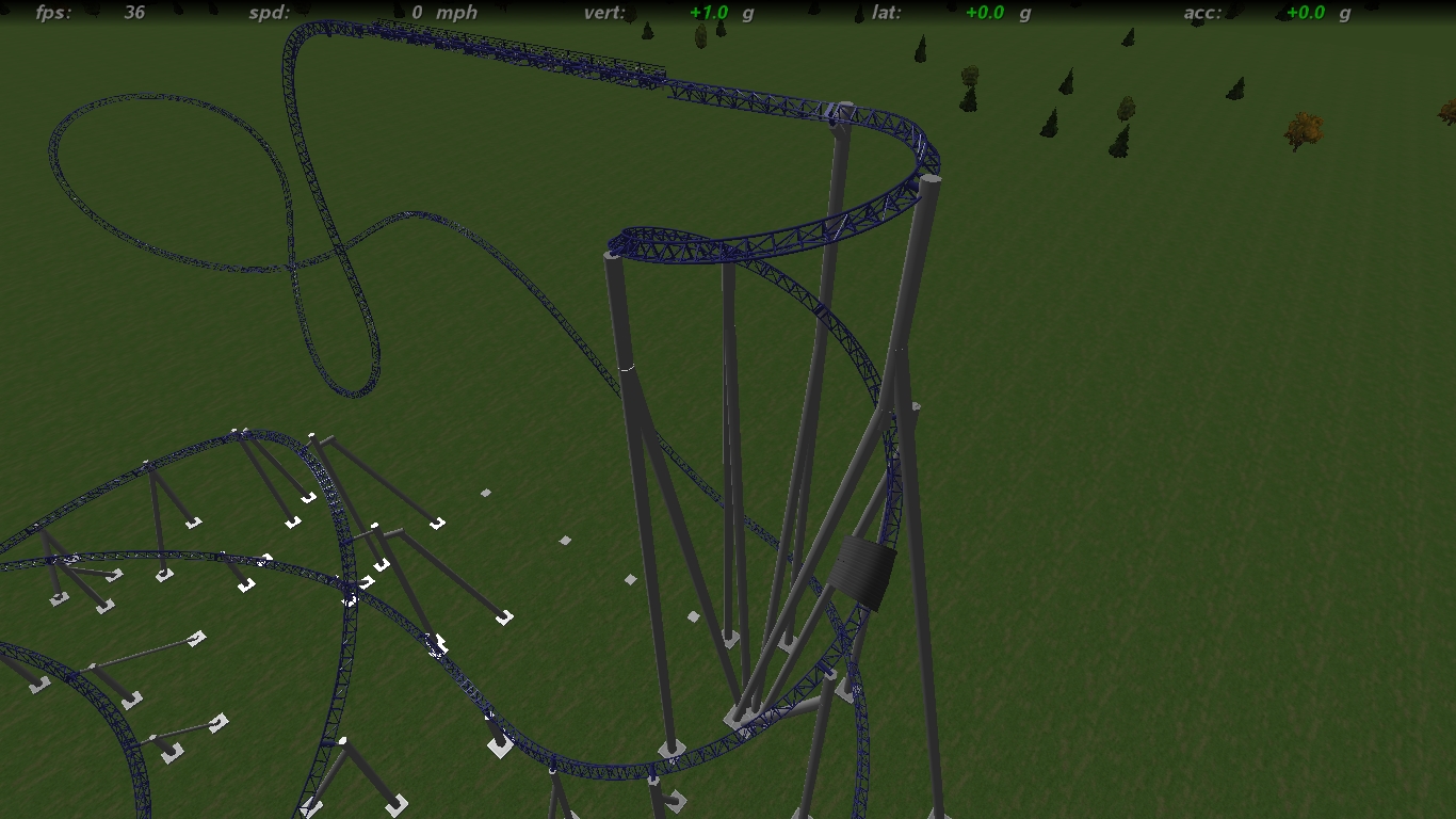
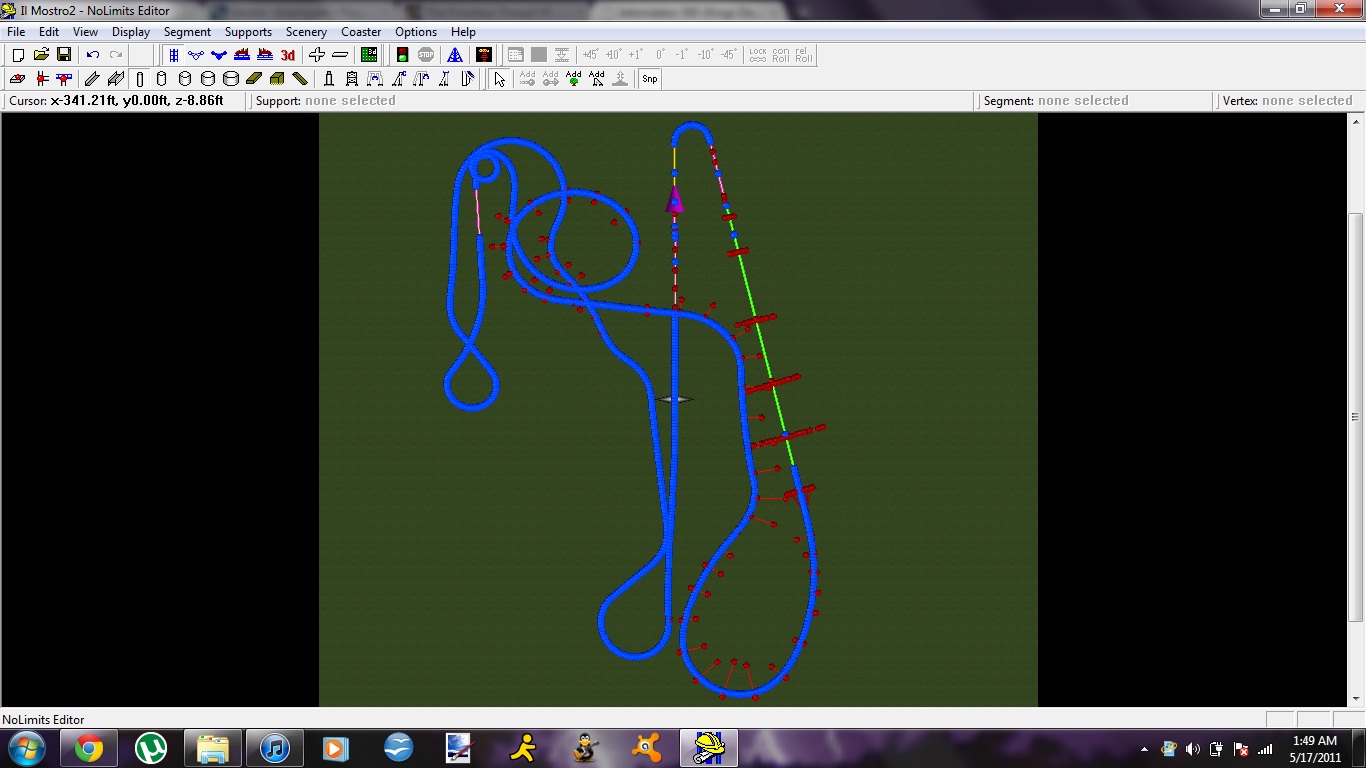
Aerial:

Image Insert:
Image
201.33 KB

Post May 18th, 2011, 10:49 pm

Posts: 325
Points on hand: 3,123.00 Points
@Jcoasters:


Image Insert:
Image
569.01 KB

@Update:


Image Insert:
Image
623.43 KB

The supports look funky to me; but I'm building them like that to prepare them to be squared. Think they'll still look odd even then?

Post May 18th, 2011, 10:54 pm
RideWarriorNation User avatar
Beta Tester
Beta Tester

Posts: 1447
Points on hand: 1,533.40 Points
Bank: 0.00 Points

Post May 18th, 2011, 10:59 pm

Posts: 325
Points on hand: 3,123.00 Points
I see him do the same kinds of posts for other topics; so I'm just taking and using what I think might be valid information. So far he's been correct about things... just very blunt.

Post May 18th, 2011, 11:51 pm

Posts: 2914
Points on hand: 5,657.00 Points
Bank: 0.00 Points
Yes, thank you Strata. Also, the pull up into the lift is still a bit to large.

Take a look at Ride Of Steel:

Image
Image
Image
[19:34:14] RideWarriorNation: jim
[19:34:27] RideWarriorNation: can you pls change sig
[19:35:22] Jcoasters: ok
[19:35:39] RideWarriorNation: ty

Post May 19th, 2011, 12:05 am

Posts: 325
Points on hand: 3,123.00 Points
I think I got it now:


Image Insert:
Image
690.36 KB

Here's some other shots:


Image Insert:
Image
525.55 KB


Image Insert:
Image
572.77 KB

Post May 19th, 2011, 12:06 am

Posts: 2914
Points on hand: 5,657.00 Points
Bank: 0.00 Points
A tiny bit more. But make sure the cars don't collide.
[19:34:14] RideWarriorNation: jim
[19:34:27] RideWarriorNation: can you pls change sig
[19:35:22] Jcoasters: ok
[19:35:39] RideWarriorNation: ty

Post May 19th, 2011, 12:11 am

Posts: 325
Points on hand: 3,123.00 Points
That's as far as they'll go without touching; there's about an inch gap so I can't really push it further. I think it's the same radius or off by a 1% at most compared to Superman you posted.

Post May 19th, 2011, 12:16 am

Posts: 2914
Points on hand: 5,657.00 Points
Bank: 0.00 Points
Then it is fine. Carry on with your work to make it less Newtony.
[19:34:14] RideWarriorNation: jim
[19:34:27] RideWarriorNation: can you pls change sig
[19:35:22] Jcoasters: ok
[19:35:39] RideWarriorNation: ty

Post May 19th, 2011, 1:26 am

Posts: 1928
Points on hand: 1,601.00 Points
Location: OH, USA
The beyond-vertical climb into the mcbr and the helix after it immediately pop out to me as horribly n00bish. Unfortunately, the rest of it is nearly impossible to judge well without actually riding it and watching the G-forces closely. Maybe you can send it to me after th elayout's all done?

Originally posted by strata force

I luff using purple on intamins, feels classy and velvety. But uh, on those other screens, it was white and dark gray.

Oh. I could've sworn it was a dark purple. Even so, the dark purple I thought I saw was absolutely gorgeous. Put it back with the white again. That was my favorite color scheme out of the ones you've posted.

Post May 19th, 2011, 1:45 am

Posts: 325
Points on hand: 3,123.00 Points
Layout is done; just not done with supporting. And noobish it may be, I think it's pretty damn fun while riding. I've been NLing for years, I'm no starter; just haven't been on this website as long.

BTW, you're reading it backwards. It's helix into MCBR into beyond vertical drop. I could send you the file if you wanna take a look.

Post May 19th, 2011, 1:27 pm

Posts: 1928
Points on hand: 1,601.00 Points
Location: OH, USA
Well, having the beyond vertical part be the drop makes it a bit better, but the helix is still, imo, awful. As fun as it is, it's just not at all realistic, and I can guarantee that you'll get dinged big time for it when you upload. But yeah, go ahead and send it to me, I'd love to take a look! Nothing better to do with my (little) free time.


Return to Hard Hat Area