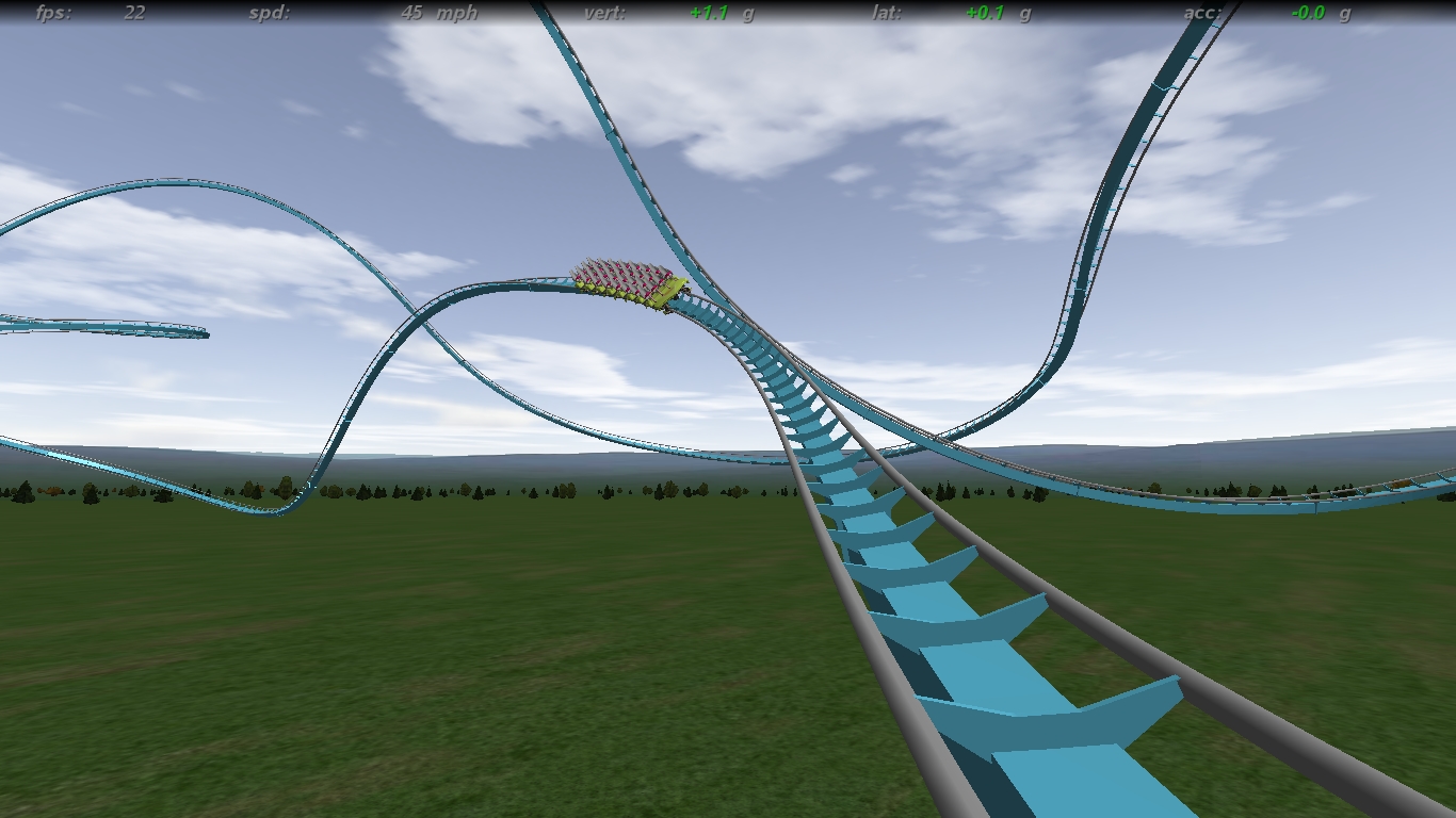
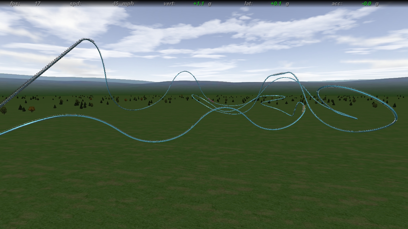
Image Insert:
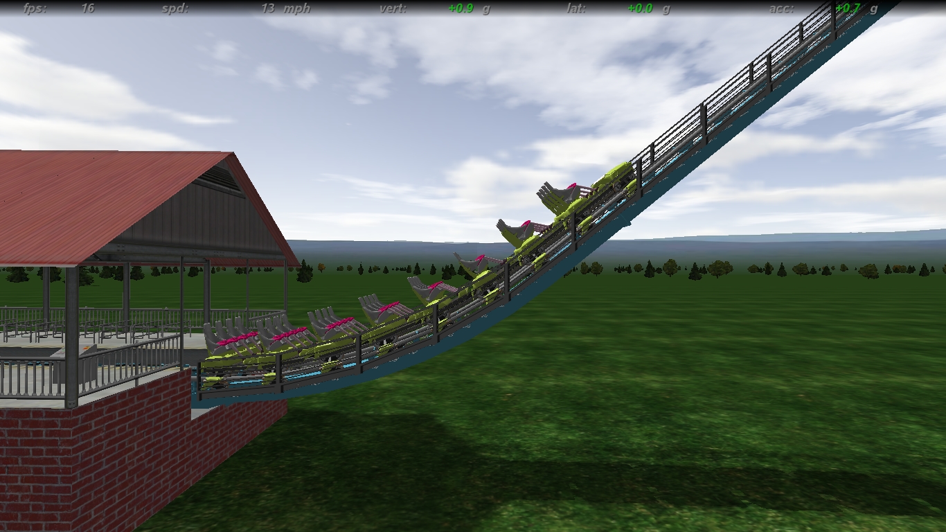
606.76 KB
Image Insert:
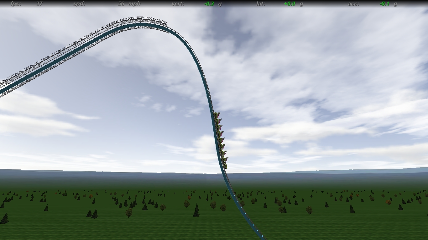
395.91 KB
Image Insert:
482.23 KB
Image Insert:
489.49 KB
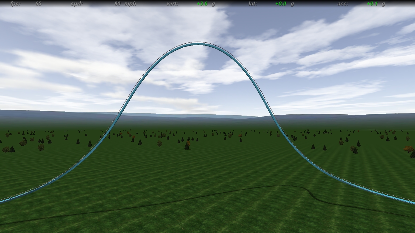
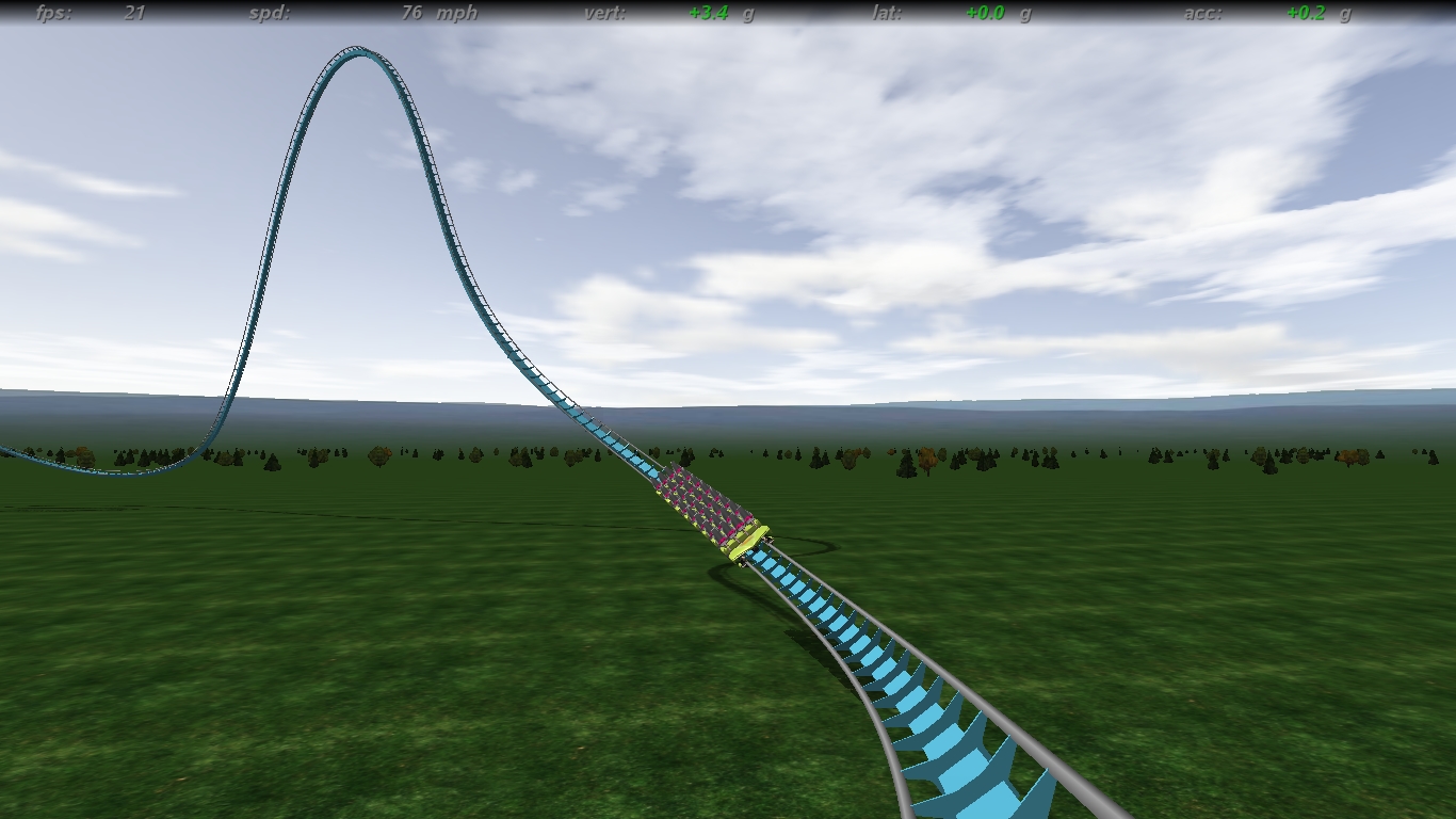
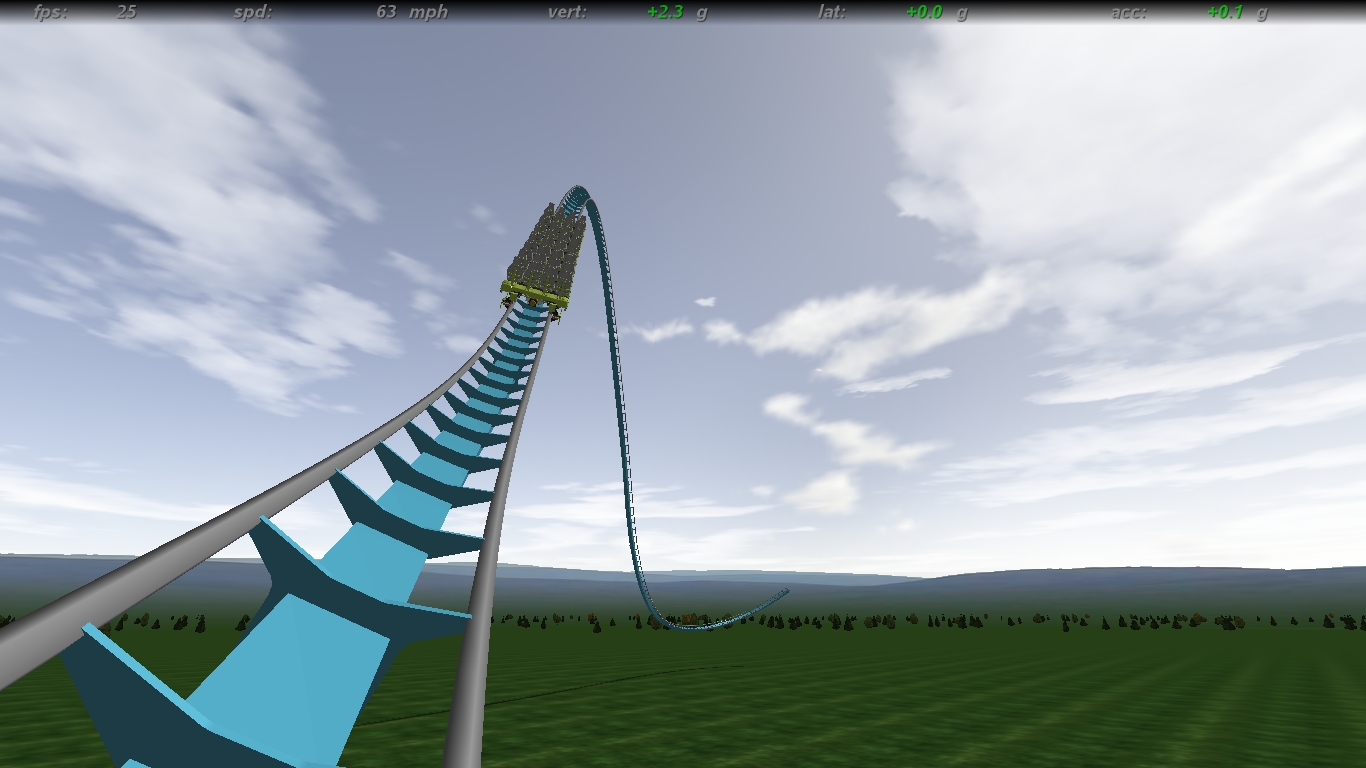
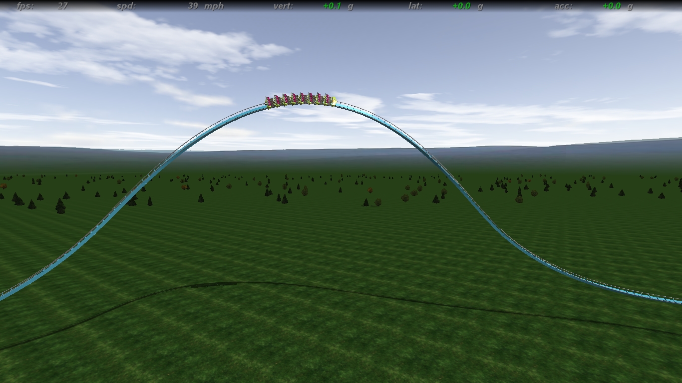
Too experimental here? Lemme know if this is too anti B&M:
Image Insert:
368.58 KB
Image Insert:
506.46 KB
Image Insert:
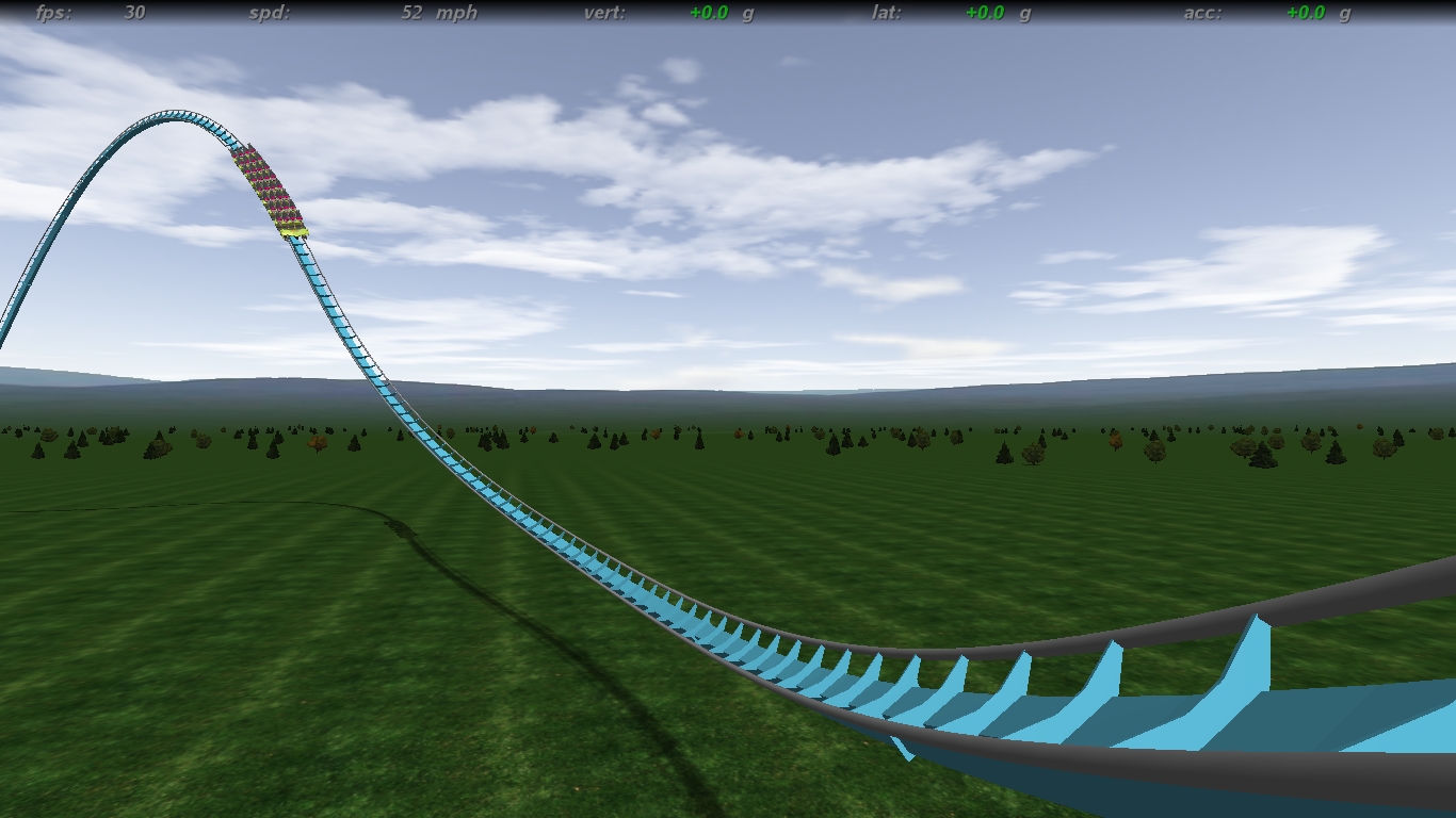
483.13 KB
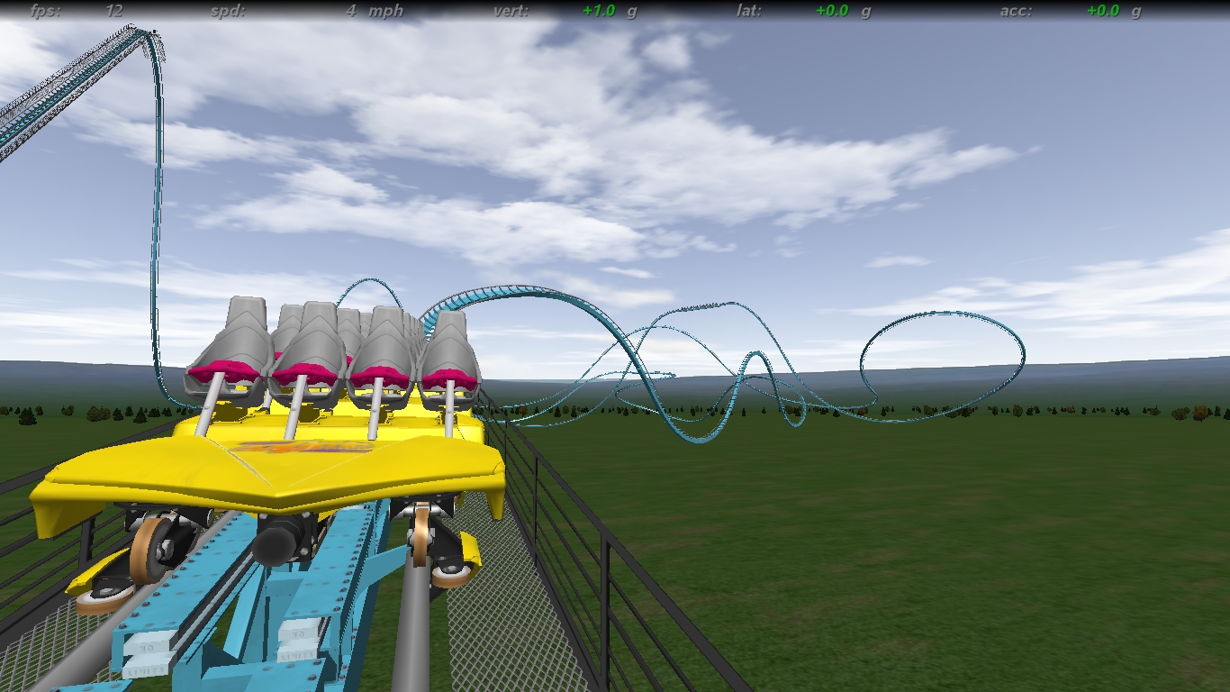
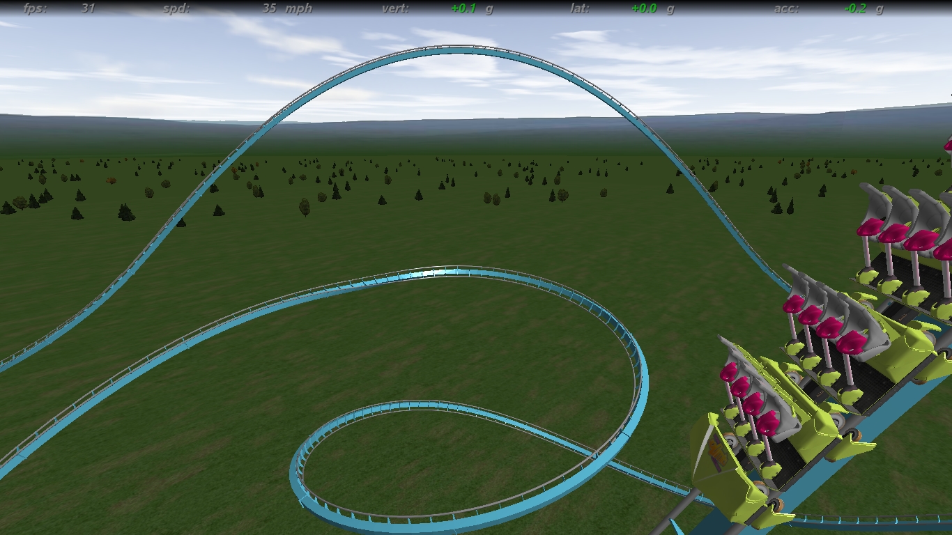
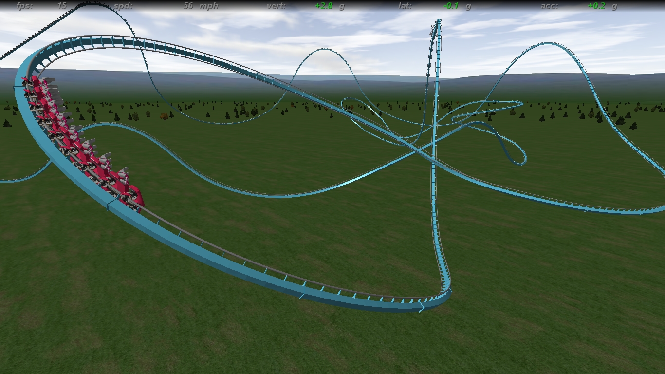
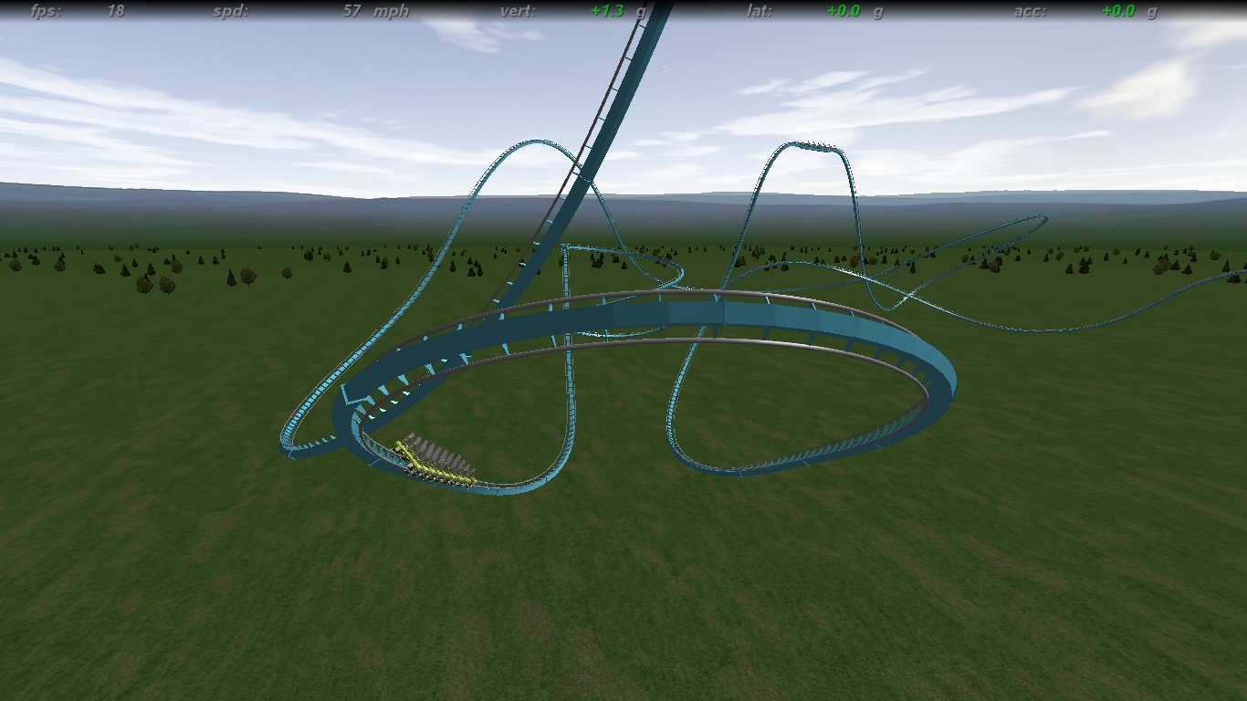
I'm attempting to condense the entire layout into the area created by the first part of the layout; so less of an out-and-back shape and more of a bowled up layout, then back layout.
Comments n such?

