Board index Public Relations Site Related 2014 CoasterCrazy Changes - Your Input Is Truly Needed!

2014 CoasterCrazy Changes - Your Input Is Truly Needed!

Posts that are directly related to the site.

Post December 29th, 2013, 11:44 pm
SauronHimself User avatar
Premium Member
Premium Member

Posts: 411
Points on hand: 1,641.00 Points
Location: USA
Originally posted by Mikey

If we do a mobile site, it will likely just be a mobile skin for the forum. Since Nolimits does not run on phones yet, it's kinda pointless to develop a mobile site for that.


I doubt a mobile version of NL would be practical given the scope of the game. Minecraft Pocket Edition is unwieldy enough as a mobile version of its desktop counterpart.

Post December 29th, 2013, 11:51 pm
Oscar User avatar
Founding Member
Founding Member

Posts: 14409
Points on hand: 11,944.60 Points
Bank: 187,052.60 Points
Location: California, USA

Originally posted by Kyle Sloane

Maybe you can add a function where there is a checkbox for rides for whether or not you have ridden them allowing for a coaster counting or ranking system.

The main page I think should still have the news at the top where those three boxes are, maybe have them able to scroll horizontally to show more updates. Like you can either hover the mouse over to the right and it would scroll or use a bar thing. That would condense that information in an elegant way I think.


I actually like these these ideas a lot. I hadn't thought of that. Thank you.

Originally posted by SauronHimself

I'd like a dedicated mobile version, and also it would be nice to have a reputation system in the forums.


I think having a layout designed specifically for mobile would be the best solution and I have thought about this. It would be a much simpler design imo but yes I have considered this.

Originally posted by Mrcobra92

I like the look and functionality of SMF 2 much better to be honest, it looks more modern and inviting. [:D]


We've had very bad problems with SMF2. The security on it is horrible and I'm not sure I personally would like to deal with it. I would have to revisit to see if the security issues have been plugged up.
Support Us! - Click Here To Donate $5 Monthly!
Paradox wrote:
No need to tell Oscar about the problems. He is magic.

Post December 30th, 2013, 4:11 am
coolbeans326 User avatar
Premium Member
Premium Member

Posts: 5229
Points on hand: 6,184.00 Points
Location: Portland, OR, USA

I still like the idea of having the news off to the side and secondary to the tracks. I think the coaster sims are the bread and butter of the website and should take the spot light.

Post December 30th, 2013, 3:04 pm

Posts: 1241
Points on hand: 95.00 Points
Bank: 2,503.00 Points
Location: Kentucky
I like the homepage and navigation ideas. The coaster/park database seems quite useless with RCDB and the TPR Park Index. I think it would be better to focus time on the NoLimits aspects and maybe Sandbox/Spotlight features.

Looking forward to the new site!

Post December 30th, 2013, 3:42 pm
Pad

Posts: 601
Points on hand: 1,981.00 Points
Location: Bern, Switzerland

Some cool ideas right there, looking good :) Also, delighted to hear that the tracks will stay! Does that mean the ratings will be saved too?

Post December 30th, 2013, 4:24 pm

Posts: 11
Points on hand: 197.00 Points
Originally posted by Oscar

Originally posted by Kyle Sloane

Maybe you can add a function where there is a checkbox for rides for whether or not you have ridden them allowing for a coaster counting or ranking system.

The main page I think should still have the news at the top where those three boxes are, maybe have them able to scroll horizontally to show more updates. Like you can either hover the mouse over to the right and it would scroll or use a bar thing. That would condense that information in an elegant way I think.


I actually like these these ideas a lot. I hadn't thought of that. Thank you.

Originally posted by SauronHimself

I'd like a dedicated mobile version, and also it would be nice to have a reputation system in the forums.


I think having a layout designed specifically for mobile would be the best solution and I have thought about this. It would be a much simpler design imo but yes I have considered this.

Originally posted by Mrcobra92

I like the look and functionality of SMF 2 much better to be honest, it looks more modern and inviting. [:D]


We've had very bad problems with SMF2. The security on it is horrible and I'm not sure I personally would like to deal with it. I would have to revisit to see if the security issues have been plugged up.

Oh they have, it's what I use for realtycoon3, I have not had one problem. The early renditions were terrible, but the newer ones are great. I do recommend looking into it.

Post December 30th, 2013, 6:42 pm

Posts: 330
Points on hand: 1,136.00 Points
I definitely would like a notification's kind of deal for the top three boxes. It's nice to know when you get a rating. Also a notification when someone replies to you maybe with an @username sort of deal. And I think that instaed of the top rated tracks last week it should be, the top rated tracks this week and then you could select week, month, year, all time like over on NLE.

Post December 31st, 2013, 6:32 am

Posts: 1192
Points on hand: 2,652.00 Points
Bank: 2,739.00 Points
Location: Poway, CA, USA

I agree with a lot of the ideas that people have. mobile accessibility and touch screen seems to be common place, so, maybe re-design the site to be more "finger friendly." I was also thinking a "meet me" feature for park meet-ups might be cool, something that automatically links cc meet ups to like a "check-in" feature similar to facebook. IDK, maybe I'm thinking this site is bigger than it really is, but, this site has a lot of potential, especially with the plug it got on the nl2 site. Social media is huge, and facebook is the foundation, so borrowing ideas from that seems logical, a social media site dedicated for coaster and theme park enthusiasts could be a big hit.
"if you found your laughin' place, how come you ain't laughin'."https://www.facebook.com/calicoaster1/

Post December 31st, 2013, 12:34 pm

Posts: 2260
Points on hand: 87.00 Points
Bank: 12,611.00 Points
Location: MI, USA
The mark of a properly designed site is one that can easily be converted to responsive design. The main disadvantage to responsive is that mobile users can't move their way up to the desktop version, so it's imperative that the responsive setup is done correctly without missing capabilities or functionality.

Users may not be able to view NL projects from a phone, but they can still rate/review/comment, read descriptions, watch YouTube videos, etc. on track postings.

Those involved in decisions regarding friendly UI support of various devices need to see this.


Post January 1st, 2014, 4:00 am
Mikey User avatar
Site Admin
Site Admin

Posts: 1598
Points on hand: 6,054.50 Points
Location: Houston, Texas

Had a meeting with our developer earlier today. We are on track for the new site to be up by February 1st 2014.
Image

Post January 1st, 2014, 4:05 am
TTD03 User avatar
True Addicts
True Addicts

Posts: 7306
Points on hand: 738.00 Points
Bank: 111,265.11 Points

Post January 1st, 2014, 3:17 pm
Oscar User avatar
Founding Member
Founding Member

Posts: 14409
Points on hand: 11,944.60 Points
Bank: 187,052.60 Points
Location: California, USA

So does anyone have any mockups of the home page? I think I have a pretty good idea of what you guys want on there. If not, can we move to the home page of the track exchange. I've not done mockups of the home page for the exchange so I am all ears for that. Please provide me the suggestions on that ASAP as I am far behind on the Statement of Work for the developer.

Thanks,
Oscar
Support Us! - Click Here To Donate $5 Monthly!
Paradox wrote:
No need to tell Oscar about the problems. He is magic.

Post January 1st, 2014, 4:44 pm
Blade User avatar
True Addicts
True Addicts

Posts: 74
Points on hand: 6,325.00 Points
Location: USA
I have a number of things in mind that I'm still brainstorming which I'll try to get out asap. In the meantime here?????????s a video explaining a helpful tool called KnowBrainer.

Post January 1st, 2014, 10:12 pm
ralexpdx User avatar
Premium Member
Premium Member

Posts: 6
Points on hand: 2,398.00 Points
Location: Portland, Oregon, USA
I agree with others in saying that bringing the focus of the site back to the simulations is more important to me. I don't live near any theme parks, but do own and play nearly every coaster/theme park theme there is. I still pay Rollercoaster Tycoon 3(?) and of course NoLimits. I will be purchasing v2 as soon as it's available. Thanks for asking what users want, it's the key to a long life for the site.

Post January 2nd, 2014, 11:15 pm
Oscar User avatar
Founding Member
Founding Member

Posts: 14409
Points on hand: 11,944.60 Points
Bank: 187,052.60 Points
Location: California, USA

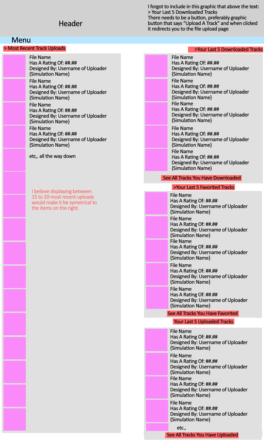
Quick mockup of what I visualize the Exchange page should be like:

Image

I know I most likely forgot something so please point it out. Statistics like your average ratings, amount of downloads you have, etc., will be displayed in your downloads subpage. What else should be displayed on the track exchange home page? I will commence mock for the track detail page.

Please provide quick feedback/suggestions/recommendation as I am late already with this.
Thanks.
Support Us! - Click Here To Donate $5 Monthly!
Paradox wrote:
No need to tell Oscar about the problems. He is magic.

Post January 2nd, 2014, 11:33 pm
TTD03 User avatar
True Addicts
True Addicts

Posts: 7306
Points on hand: 738.00 Points
Bank: 111,265.11 Points
I like it, looks really good.
If we could reorder the list to whatever we want on the right column that would be cool.

Post January 2nd, 2014, 11:37 pm

Posts: 1192
Points on hand: 2,652.00 Points
Bank: 2,739.00 Points
Location: Poway, CA, USA

That looks really cool. Maybe a header with the top 5 tracks overall, either by rating or number of downloads could be useful.
"if you found your laughin' place, how come you ain't laughin'."https://www.facebook.com/calicoaster1/

Post January 2nd, 2014, 11:37 pm
A.S.C. User avatar
Beta Tester
Beta Tester

Posts: 563
Points on hand: 59.00 Points
Bank: 1,276.00 Points
Location: Mason, Ohio, USA
I don't how I feel about all of the different sections, like last five favorited tracks could probably go. Maybe have it as your top 5 rated tracks or something? If you're able to make it just take your score on rides and put together a top rated list based on only your ratings. I think it would be more interesting/useful than showing the last 5 that you favorited. Otherwise it looks nice, I'm still rooting for a like/dislike system though...

Post January 12th, 2014, 10:47 am

Posts: 673
Points on hand: 209.00 Points
Bank: 3,034.00 Points
Location: I am everywhere O____O
I would love to see Exchange uploads sorted by track style, speed, length, height, inversions, and largest drop.

Sometimes, I may look for a specific type of coaster, either for my own building studies or just in the mood for a particular ride, it would be amazing to have flexible search options in checkbox form

Post January 12th, 2014, 11:40 am

Posts: 2892
Points on hand: 9,697.00 Points
Location: Philadelphia, Pennsylvania
Just thought of this, Oscar.

I think collaborations on NL2 projects are going to become more common, as a park file with many coasters and theming is a huge undertaking. Maybe it's possible to have an upload by more than one user? Like, User A does the actual uploading, but on the upload page there can be a box that says "collaborators" and you can type in another member's name (or more than one other member) and then on the download page, at the top, it will say "is a [type] Coaster by User A, User B, User C."

Image Insert:
Image
100.3 KB

Image Insert:
Image
42.32 KB

Post January 12th, 2014, 12:17 pm

Posts: 5852
Points on hand: 5,806.00 Points
Location: Toronto, Ontario, Canada

Whatever you do Oscar, keep the site simple and consistent.

Personally, I'm not a fan of sites that try to overload users with information. Having a thousand images and links on a page doesn't mean that the information will ever be used.

I'm also not a fan of having a million "share this on twitter/facebook/4square/whateverelse/etc/etc/etc" buttons or links. Whats the point? Do people actually use those? For example that floating thing on the left of the current site, there is no way I would ever use that.

Post January 12th, 2014, 1:25 pm
Oscar User avatar
Founding Member
Founding Member

Posts: 14409
Points on hand: 11,944.60 Points
Bank: 187,052.60 Points
Location: California, USA

The share this on the left of the side purely for statistics purposes. I needed an independent statistic taker and this happened to be the quickest solution at hand. Needed verification of some anomalies in our in house statistics system and needed to know if the system had broken or if said things were really happening. Though, after adding it, we learned some interesting stuff and that's why its still around. I will have something less obtrusive as soon as I can but I been quite busy with other underlying code stuff [;)]

While the home page count on that bar doesn't seem to change, the count is individual per site and I am very surprised to see how much stuff gets shared through it.
Support Us! - Click Here To Donate $5 Monthly!
Paradox wrote:
No need to tell Oscar about the problems. He is magic.

Post January 12th, 2014, 9:26 pm
Blade User avatar
True Addicts
True Addicts

Posts: 74
Points on hand: 6,325.00 Points
Location: USA
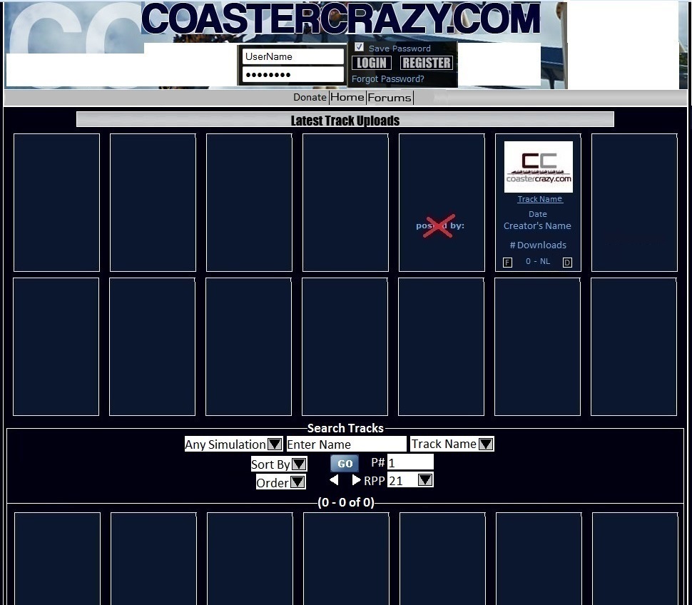
Here?????????s what I thought about.

Image

Image

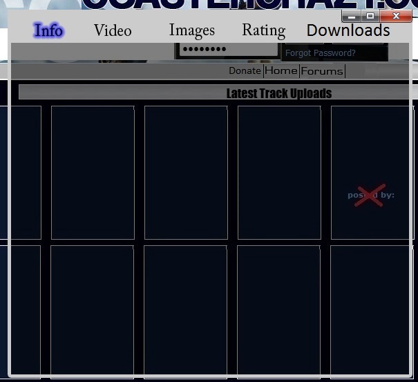
1. Clicking on the track?????????s name will bring up the menu screen with a number of selections which are.

Info: Gives a description about the track.

Video: Self Explanatory

Images: Self Explanatory

Rating: Shows a list of ratings/descriptions. Give a rating/description.
Downloads: Shows a list of people that downloaded the track.

2. Clicking on the creator?????????s name will show a dropdown menu with a number of selections which are.

Profile: Self Explanatory

Tracks: Brings you to a page with a list of creator?????????s tracks, favorites, and scraps.

3. F: Click this to add the track to your favorites. D: Click this to download the track.

Search Tracks
Sort By: Date, Rate, # Downloads, or Name

Order: Descending or Ascending

P#: Page #

RPP: Results Per Page

Previous

Return to Site Related


  • Related topics
    Replies
    Views
    Last post
cron