Board index ‹ Roller Coaster Games ‹ Hard Hat Area ‹ Thrill Zone The Giga Update!
That's like finding a Waffle House with no white trash in it.
Thrill Zone The Giga Update!
90 posts
• Page 1 of 4 • 1, 2, 3, 4
Not the weather you'd expect when a demon is coming..
That actually looks pretty good. Couple of pointers though if you're changing anything at this point:
The crest of the lift hill should be tighter, then have a gradual curve down. For example, you might wanna look at a picture of a similar coaster to nail the shaping, like Goliath at Le Ronde
B&M airtime hills can be very difficult to replicate but it should be parabolic and kinda pointy at the top
Supports look good so far. Either make the last 2 or 3 supports on the lift hill less wide or make it an A-frame support like the ones on Leviathan.
Colors look really good for the theme you're going for, but like Timmvs said you may want to go for a custom environment for something like your theme. A "bright, sunny day" doesn't fit the "demon" theme
Other than that this looks great. Keep it up!
This is actually a really good hyper, I'm surprised. As long as you make sure the hills are all 0G's and shaping is on par, as well as you use that depumper tool to it's best, you can find yourself finishing a very good coaster.
Are you accepting testers? 
Coaster Count - 198
France 2019 Mini Trip Report
France 2019 Mini Trip Report
You're getting the hang of shaping, Deere! 
-- I was happy to be with NL1. --
Personal coaster count as of 3/2025 -- 222
"500" perhaps by the end of this year.
I will be a Thai citizen if possible in a few years.
Personal coaster count as of 3/2025 -- 222
"500" perhaps by the end of this year.
I will be a Thai citizen if possible in a few years.
As said above this is looking really good! I am very happy to have helped you! This is a huge upgrade from your previous coasters!
Sometimes I dream of unicorns and oreos
^^ Can't wait to see your shaping skills getting better! Wow promising! 
-- I was happy to be with NL1. --
Personal coaster count as of 3/2025 -- 222
"500" perhaps by the end of this year.
I will be a Thai citizen if possible in a few years.
Personal coaster count as of 3/2025 -- 222
"500" perhaps by the end of this year.
I will be a Thai citizen if possible in a few years.
That is looking really good! Cant wait to see more!
Sometimes I dream of unicorns and oreos
Ill need help with Some Supporting on this but heres some of the Elements on BlackHawk


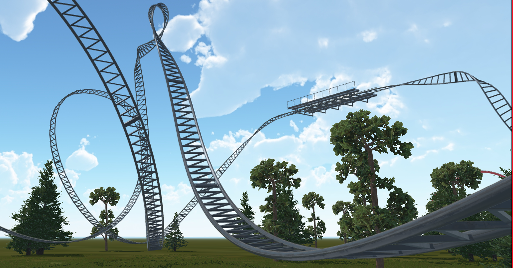
What's going on with that loop? Also that roll looks very tight.
Coasterkidmwm wrote:
gouldy wrote:
Just don't employ stupid people and you're golden.
That's like finding a Waffle House with no white trash in it.
I believe its a hangtime loop. Shaping may be a bit off, but It looks like it would create zero g's at the top.
Sometimes I dream of unicorns and oreos
I was about to say it looked like a hangtime loop. Everything looks good. Supporting Eurofighters can be difficult, I agree.
ok guys im deciding on the next coaster some will be added eventually but others wont but I want to do a vote on what will be next
1)Maurer S??hne Spinning Coaster
2)B&M Invert Older Model
3)Mack Launch Coaster
4)B&M Flyer
5)B&M Giga
6)B&M Floorless
7)B&M Sitdown
8)Intanim Rocket Coaster
9) B&M Wing Coaster
1)Maurer S??hne Spinning Coaster
2)B&M Invert Older Model
3)Mack Launch Coaster
4)B&M Flyer
5)B&M Giga
6)B&M Floorless
7)B&M Sitdown
8)Intanim Rocket Coaster
9) B&M Wing Coaster
I would say Mack Launch or Maurer Spinning, those two are the easiest to make a track out of.
^there now all a lot easier to make now thanks to Newton 2
^I knew you switched building methods! I had a feeling you did, and I was right! If you're going to make anything with high pacing definitely watch the lats; even I make transitions too fast with 2+ years of experience.
I say do a Mack Launched or a Intamin Rocket. B&Ms take a lot of discipline to make, and take lots of patience. By the way the hyper coaster looks great now.
I say do a Mack Launched or a Intamin Rocket. B&Ms take a lot of discipline to make, and take lots of patience. By the way the hyper coaster looks great now.
I had an awesome idea for a B&M Sitdown that launches like thunderbird
Sorry for the double post but im selecting 5 people to test this Park so pm me if you want to test it!!
I like Deere's hangtime loop better than a "WOT" element! 
-- I was happy to be with NL1. --
Personal coaster count as of 3/2025 -- 222
"500" perhaps by the end of this year.
I will be a Thai citizen if possible in a few years.
Personal coaster count as of 3/2025 -- 222
"500" perhaps by the end of this year.
I will be a Thai citizen if possible in a few years.
just a little teaser


^Your images aren't showing. Are you sure you embedded it correctly?
90 posts
• Page 1 of 4 • 1, 2, 3, 4
-
- Related topics
- Replies
- Views
- Last post
-
- Thrill Zone America
 by deere839 » June 13th, 2015, 2:30 am
- 11 Replies
- 1432 Views
- Last post by Coaster Hero

July 1st, 2015, 11:57 am
- Thrill Zone America
-
- Riptide - Intamin Giga -- UPDATE --
by Flickstah » July 4th, 2010, 3:39 am - 8 Replies
- 1511 Views
- Last post by ianko66

July 20th, 2010, 10:36 am
- Riptide - Intamin Giga -- UPDATE --
-
- GerstlCrazy's Garbage - Giga Update 12/25
1, 2, 3, 4by GerstlCrazy » April 15th, 2015, 3:31 am - 78 Replies
- 9533 Views
- Last post by lol240

December 28th, 2016, 2:13 am
- GerstlCrazy's Garbage - Giga Update 12/25
-
- War Zone
1, 2by IntaminFan397 » May 4th, 2005, 3:53 am - 43 Replies
- 3681 Views
- Last post by hyyyper

May 27th, 2005, 6:18 am
- War Zone


