Board index ‹ Roller Coaster Games ‹ Hard Hat Area ‹ The Deere839 Construction Thread-Huge Update!
Dat's from Rip Ride Rockit. Not made by B&M.
Huge thanks to the team for helping out big time
I clearly remember putting flanges on Venom so either Deere's distance rendering is really low or i'm terrible at remembering to add flanges.
That's like finding a Waffle House with no white trash in it.
.______.
The Deere839 Construction Thread-Huge Update!
Coaster Hero wrote:
deere839 wrote:
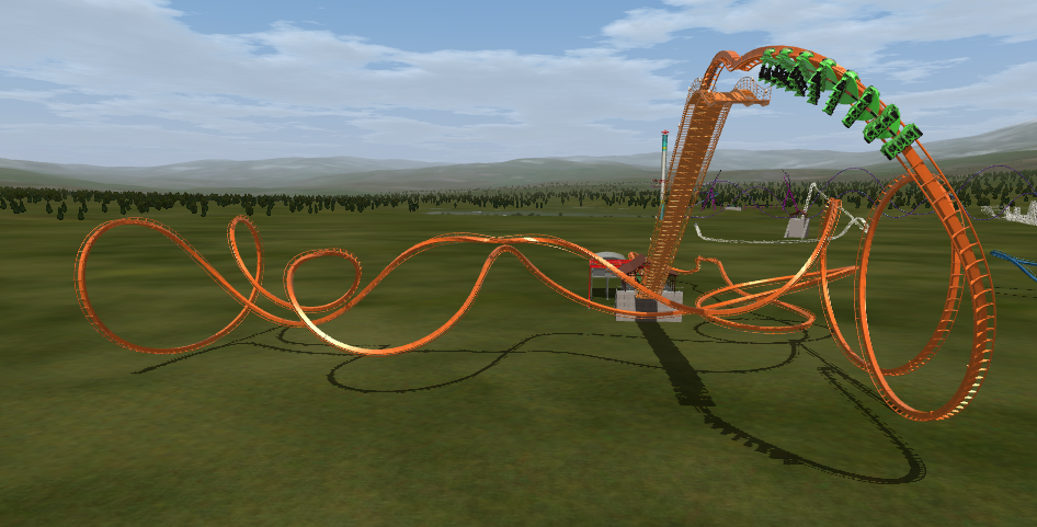
It's pretty good but it would be even cooler if you banked the top like F325's "treble clef turn" as it's now called.
Dat's from Rip Ride Rockit. Not made by B&M.
"Careful man, there's a beverage here!"
^Yeah, but then again it only really became relevant after F325
Kingda Ka plans
- Attachments
-
- King Da Ka.png (7.92 KiB) Viewed 1898 times
Sorry for the double post but heres some River Side Tease thanks to the team and a update on the concept art


^ This is really impressive! 
-- I was happy to be with NL1 - [:')] --
Next Update will be one of the Biggest Updates yet we are hoping it will happen Oct 2nd
Hint one for the next update is 4285
A 4285 foot long hyper maybe?
Sometimes I dream of unicorns and oreos
My second creation for deere, on the second of October...
Mind Bender at SFOG is pretty great
Check out my WIP thread
Currently working on Thunderbolt, a second generation Schwarzkoph.
Check out my WIP thread
Currently working on Thunderbolt, a second generation Schwarzkoph.
^ I want to see that "mentioned" track! 
-- I was happy to be with NL1 - [:')] --
As promise a River Side Update
This will be the parks logo as soon as supports are done for the hyper and the mine train is added with the wing coaster

The SeaWitch finial Layout
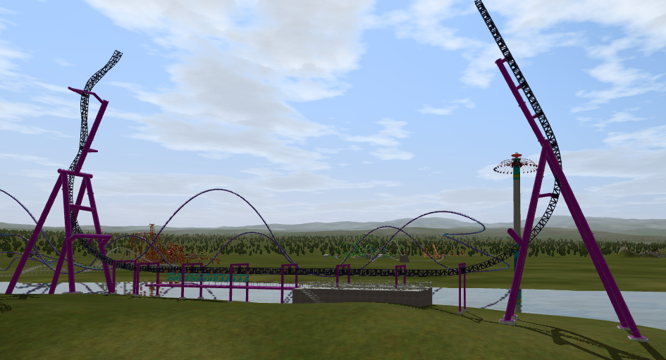
Aughisky standing proud still need to add the splash down

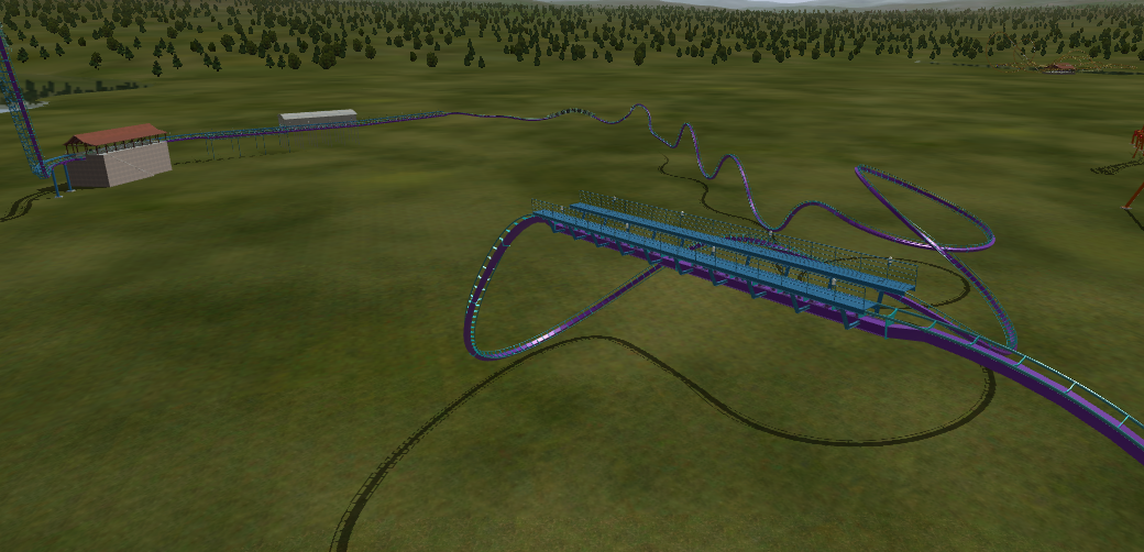
More screen shots of Aughisky
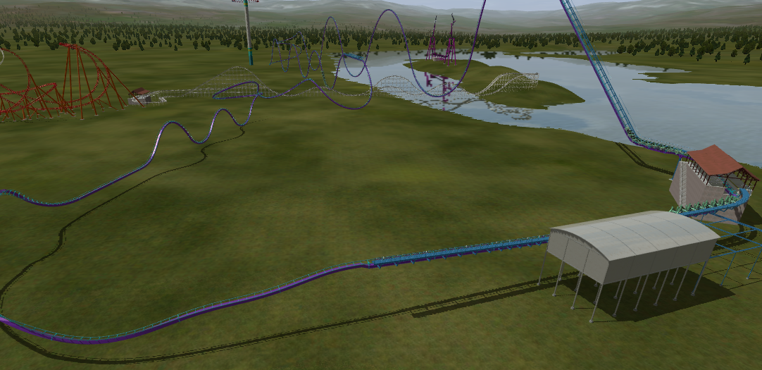
next Tannin
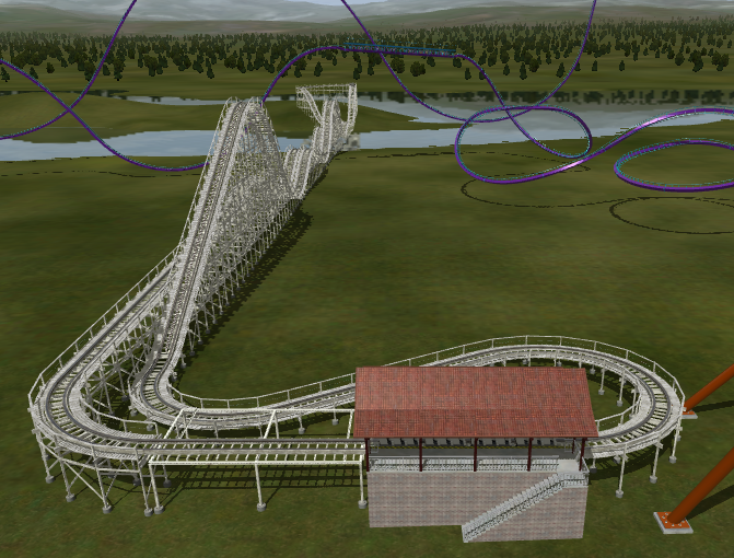
Next Venom
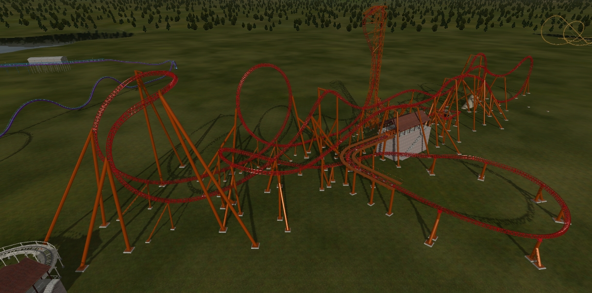
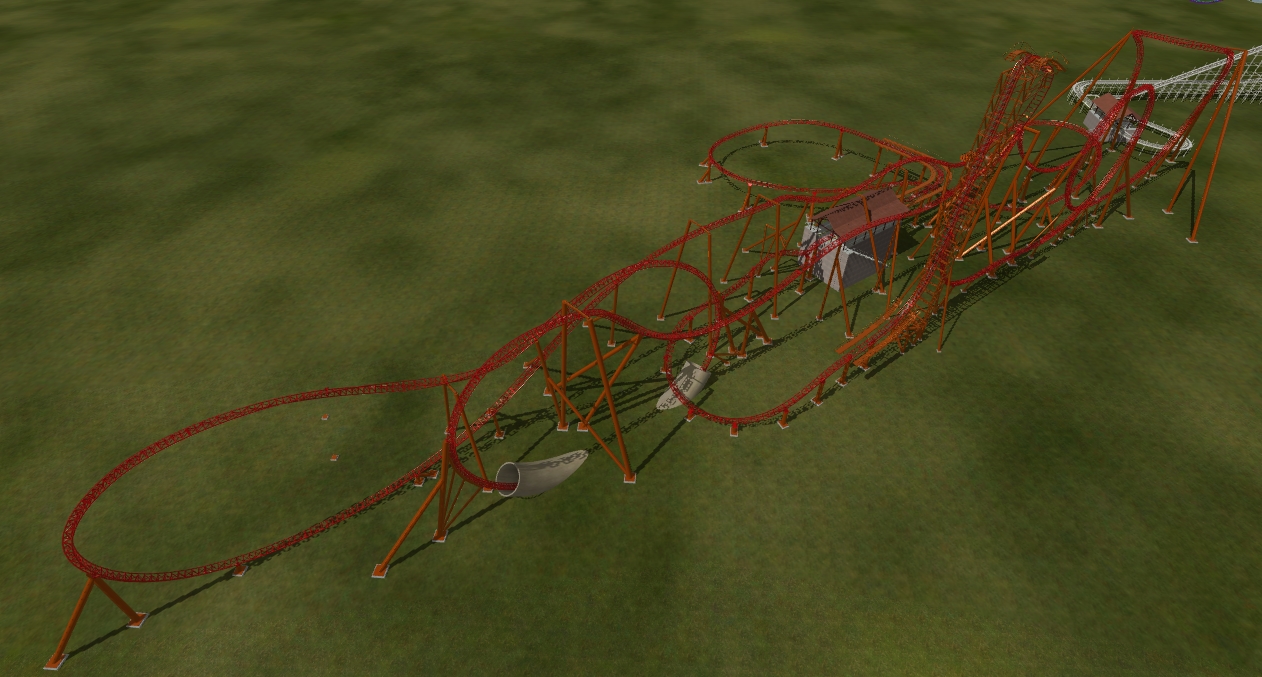
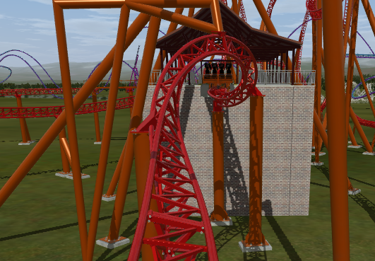
Now the Hippogriff
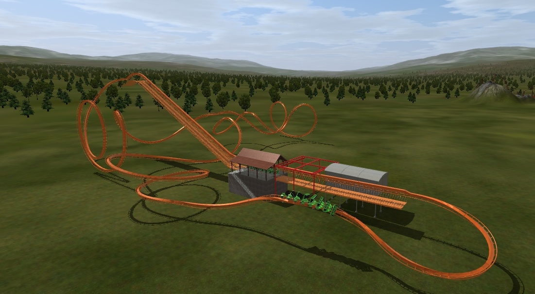
This will be the parks logo as soon as supports are done for the hyper and the mine train is added with the wing coaster

The SeaWitch finial Layout

Aughisky standing proud still need to add the splash down

More screen shots of Aughisky


next Tannin

Next Venom


Now the Hippogriff


Very nice update. I must say that on the hyper the end is a let down... Its very meh... Maybe instead of after the "splashdown" piece of track you could maybe add a small airtime hill into a helix into the brakes.
The seawitch looks like it has a funky support on the twisted side of the track. Could just be the angle of the picture.
As for supports make sure you add flanges to Venom's also those supports don't really look like they would fit the Infinity style. Use Smiler and other infinities as a reference.
Personally I absolutely love that invert and have nothing to critique about it. It looks like a solid ride! Great job!
Sometimes I dream of unicorns and oreos
Deere, all of your rides look rideable... plus long now! 
-- I was happy to be with NL1 - [:')] --
lol240 wrote:
Deere, all of your rides look rideable... plus long now! 
Huge thanks to the team for helping out big time
Blase Rhine wrote:
Very nice update. I must say that on the hyper the end is a let down... Its very meh... Maybe instead of after the "splashdown" piece of track you could maybe add a small airtime hill into a helix into the brakes.
The seawitch looks like it has a funky support on the twisted side of the track. Could just be the angle of the picture.
As for supports make sure you add flanges to Venom's also those supports don't really look like they would fit the Infinity style. Use Smiler and other infinities as a reference.
Personally I absolutely love that invert and have nothing to critique about it. It looks like a solid ride! Great job!
The seawitch looks like it has a funky support on the twisted side of the track. Could just be the angle of the picture.
As for supports make sure you add flanges to Venom's also those supports don't really look like they would fit the Infinity style. Use Smiler and other infinities as a reference.
Personally I absolutely love that invert and have nothing to critique about it. It looks like a solid ride! Great job!
I clearly remember putting flanges on Venom so either Deere's distance rendering is really low or i'm terrible at remembering to add flanges.
Mind Bender at SFOG is pretty great
Check out my WIP thread
Currently working on Thunderbolt, a second generation Schwarzkoph.
Check out my WIP thread
Currently working on Thunderbolt, a second generation Schwarzkoph.
Some Advertisements ive been working on!


Those terrain textures in the second pic need more work.
Coasterkidmwm wrote:
gouldy wrote:
Just don't employ stupid people and you're golden.
That's like finding a Waffle House with no white trash in it.
Paradox wrote:
Those terrain textures in the second pic need more work.
.______.
Mind Bender at SFOG is pretty great
Check out my WIP thread
Currently working on Thunderbolt, a second generation Schwarzkoph.
Check out my WIP thread
Currently working on Thunderbolt, a second generation Schwarzkoph.
Clever slogans you got there
Yeah I agree the textures need a huge update. Nice prices 
Sometimes I dream of unicorns and oreos
Top Tip: Check out free font sites such as dafont (google search) or any other alternative to make your advertisements look more original (text wise)
Coaster Count - 198
France 2019 Mini Trip Report
France 2019 Mini Trip Report
^This. Definitely this, fonts can make all the difference with your graphic design! Another thing you want to consider is unique typography, like making a logo or such but that's kinda advanced in terms of what software you'll use. In my graphic design class in school we have access to all of Adobe's software including Photoshop and Illustrator so that works flawlessly. In Paint you'll have to be creative to get what you want as it's very limited. My recomendation is to download Gimp, another image manipulation program. Simply put, it's a free version of Photoshop; it can do almost everything Photoshop can do (plus a few extras) and it's free and with lots of custom content. With that program you can get really unique and professional-looking advertisements and logos!
TL:DR - Try different fonts and I encourage you to experiment with the design. Also give Gimp a try
TL:DR - Try different fonts and I encourage you to experiment with the design. Also give Gimp a try
Dafont - KG9 showed us that website in another thread! 
-- I was happy to be with NL1 - [:')] --
Once you can add trees and stuff this should really fill in.
"Careful man, there's a beverage here!"
-
- Related topics
- Replies
- Views
- Last post
-
- Pendulum : Construction Update thread
by necrodude31 » June 10th, 2009, 6:18 pm - 21 Replies
- 4635 Views
- Last post by skyscraper

November 3rd, 2019, 5:53 am
- Pendulum : Construction Update thread
-
- Cascade Mountain:Update 8/21 HUGE Pics!
by RRollergod » August 19th, 2006, 6:00 pm - 8 Replies
- 1412 Views
- Last post by RRollergod

August 21st, 2006, 8:33 pm
- Cascade Mountain:Update 8/21 HUGE Pics!
-
- Project Forest Falls:HUGE Update 12.19
1, 2by ljtplane » August 18th, 2009, 12:30 pm - 34 Replies
- 6989 Views
- Last post by Live on earths ass

April 19th, 2010, 3:17 pm
- Project Forest Falls:HUGE Update 12.19
-
- FuriousHornet Construction Thread
1, 2 by FuriousHornet » November 9th, 2015, 4:36 pm
- 36 Replies
- 5616 Views
- Last post by lol240

June 3rd, 2016, 12:48 am
- FuriousHornet Construction Thread


