Board index ‹ Roller Coaster Games ‹ Hard Hat Area ‹ Raptor Pyrenees and Katun inspired Invert
Haha i didn't even notice that in his pics until you said, it's like 10fps in the first two pics. I hope its just your computer Kyle.

Raptor Pyrenees and Katun inspired Invert

I kinda like the old colors.....
American Eagle Lover
Nice to know. So what color supports would go with the old colors? I was thinking just dark red supports. Not as dark as the track spine, but not too vibrant.
^I actually like that idea!
American Eagle Lover
Well i tried it already and it looks great imo. Not too distracting or tacky looking. I tried green, and other color supports and it looked stupid. Black or white are not an option either. So ill just see what people say and make a descision later.

I lurv the layout you have now Kyle. I know there were some people who don't like the 'unbalanced' proportion of inversions distributed between halves of the ride, but I think it's fine. If you consider a ride like Flight Deck at CGA that only has 3 inversions in the first place, you take less for granted with this ride haha.
Although FD looks to have some monster forces on it, so no hating. Just providing an instance.
Although FD looks to have some monster forces on it, so no hating. Just providing an instance.
Did you try a grayish color for the supports with this scheme? While I think the red will look beautiful, more options never hurt anyone [;)]
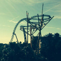
Well heres a pic of each-


Did charcoal gray not work too well? That was more what I was thinking with the gray support suggestion. I do like that red, though.

I really like this colour scheme... [:)]
http://i724.photobucket.com/albums/ww24 ... 943000.jpg
And pretty good layout too. Looking forward to seeing the development of this, you're beginning to be a really cool designer IMO.
http://i724.photobucket.com/albums/ww24 ... 943000.jpg
And pretty good layout too. Looking forward to seeing the development of this, you're beginning to be a really cool designer IMO.
I'm not sure on support colors, but the track and train look marvelous together, so those colors should definitely stay. Also, I'm loving the environment around the ride with the plants, water, and lily pads.
Well i just finished the env. Heres the semi final colors/ env.

Take note of the cherry blossoms and willow trees.
I think its beautiful already and will look even better with the 3ds and supports. Im planning on having a bridge that goes out to the center of the layout with an Chinese architecture gazebo and station and probably a tower like building. I will make it simple enough that it wont kill the fps tho. I will have nice touches of theming during the queue too, and probably a queue bridge over the track near the corkscrew or something.
damn I'm impressed!!! this looks really sexy!!!
My Youtube: http://www.youtube.com/user/Marci19177
I decided to make the lake more finite and make it less riverish. Heres more pics of the ride btw since i wont be giving any updates for like 4 days.


God this is gorgeous.
lol thanks?

Burn in hell,you're too good.

I'm really impressed by the sorrounding. Liked the first layout more, but this looks pretty too. First I didn't liked the track colours but they fit perfectly to the sorrounding!
I'm looking forward for the upload!
I'm looking forward for the upload!
DAMN this is looking good!!!
American Eagle Lover
Might be overboard on the cherry blossoms? lol
Love the FPS.
Love the FPS.
Looks great, the lillipads are a really good touch. But yeah, I'm with Real, you don't need the ground to be covered with foliage to achieve a good effect. I think the cherry blossoms and grass especially look overdone at the moment.


Originally posted by Real
Might be overboard on the cherry blossoms? lol
Love the FPS.
Might be overboard on the cherry blossoms? lol
Love the FPS.
Haha i didn't even notice that in his pics until you said, it's like 10fps in the first two pics. I hope its just your computer Kyle.
^I thought exactly the same thing when I saw this last set of pics. It's absolutely beautiful to look at, but it's too dense I think for the effect you're going for.
Custom Station anyone?
Yeah i agreed. Changed my env alot. Before i needed the grasss to cover the ground because it was so much lighter than the ground itself and it looked awkward when it was just in little amounts, but i changed the grass color to almost match the ground, as well as make the grass wider, and it looks a TON better.


The new trees! High quality textures bra!


The new trees! High quality textures bra!
-
- Related topics
- Replies
- Views
- Last post
-
- katun new video!
1, 2by josh00110 » December 17th, 2005, 5:37 pm - 39 Replies
- 5134 Views
- Last post by josh00110

December 20th, 2005, 9:22 pm
- katun new video!
-
- New B & M invert
by Bottom_Feeder_13 » August 19th, 2011, 11:54 am - 4 Replies
- 1911 Views
- Last post by Bottom_Feeder_13
August 21st, 2011, 7:42 pm
- New B & M invert
-
- invert.a
by craigster001 » May 20th, 2011, 4:48 pm - 2 Replies
- 1622 Views
- Last post by craigster001
May 22nd, 2011, 2:15 am
- invert.a
-
- Tannenbaum - B&M invert
by Jonny Richey » December 24th, 2011, 1:01 pm - 10 Replies
- 1381 Views
- Last post by eries
December 26th, 2011, 1:05 am
- Tannenbaum - B&M invert
-
- traveling invert
by gazag » October 1st, 2006, 10:54 am - 3 Replies
- 1434 Views
- Last post by gazag
October 1st, 2006, 11:21 am
- traveling invert