
In case you didn't notice already, there has been one or two minor updates on the site. Both WWS.Com and CC.Com have recieved a brand spanking new banner and the chat room is now open again.
Users found using multiple user names in the chat will have thier accounts suspended without question. The chat logs are checked daily by the staff so you have been warned!
Anyway, since everyones opinion is valid on this site, we wont to know if you prefer the new header to the previous one. So answer below
Board index ‹ Public Relations ‹ Site Related ‹ Site Updates!
 October 19th, 2005, 4:23 pm
awesome, the bug still works! [:D] woohoo!
lol, woops! I only saw the first few lines and then i was in the chat already!![[lol]](https://coastercrazy.com/forums/images/smilies/icon_e_ugeek.gif "test")
cool, go for it [:)]
Site Updates!
45 posts
• Page 1 of 2 • 1, 2
like the new header cause i love "twisty" coasters and its nice to see black and not just blue and white!!!
I don't care....
P.s. It looks cool.
P.s. It looks cool.
Hmmm i think you should get rid of the blocky white box but yea . . . are you guys gonna change the blue on every page?
The purpose of the white box is the make the text underneath it visible, otherwise it is lost in the background 
well then make it take up the whole top section so regular parts of the header are covered

to be honest i cant really remember the old one but the new one is cool
edge i say you keep it how it is I like

nice banner [:)] also admins, can i play again in the chatroom with that "bug" ???[:D][:D]
plzz forget my last post because the new header hadnt shown up then. I like the new one is that ride colossus by the way
Originally posted by Dirk_Ermen
nice banner [:)] also admins, can i play again in the chatroom with that "bug" ???[:D][:D]
nice banner [:)] also admins, can i play again in the chatroom with that "bug" ???[:D][:D]
awesome, the bug still works! [:D] woohoo!

I don't care for it for two reasons:
A: The white. It just looks...odd. I'm not sure WHY, but I definatly don't like it.
B: It's rather big. If you eliminated the 20 pixels or so outside each horizontal line, that'd help some here. It just takes up too much of the page for my tastes.
A: The white. It just looks...odd. I'm not sure WHY, but I definatly don't like it.
B: It's rather big. If you eliminated the 20 pixels or so outside each horizontal line, that'd help some here. It just takes up too much of the page for my tastes.
Dirk did you even bother reading my post?

Cool new banner!
Originally posted by Edge
Dirk did you even bother reading my post?
Dirk did you even bother reading my post?
lol, woops! I only saw the first few lines and then i was in the chat already!


I wished there was a no prefrence header as I kinda liked the old one better, but I like whats pictured in the new one, but the old one was still cooler, but w/e.

Nice and spiffy fellas ... good stuff for certain!

^Spiffy = the win.
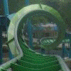
I like the banner... might I inquire as to what ride that is?
I like the banner... might I inquire as to what ride that is?
does say storm runner something? and then the snake dive...
It is indeed storm runner, the beauty is that we can randomise the images if we wanted to. Like the random image generator for the front page just with the header
Originally posted by Edge
It is indeed storm runner, the beauty is that we can randomise the images if we wanted to. Like the random image generator for the front page just with the header
It is indeed storm runner, the beauty is that we can randomise the images if we wanted to. Like the random image generator for the front page just with the header
cool, go for it [:)]

The new banner is not bad, although I am still partial to the last one.
I got rid of some of the whiteness as someone said

i like the old one better this one is just different maybe i just need to get used to it
I really like it, its all cool and stuff. and a new look is always good
45 posts
• Page 1 of 2 • 1, 2
-
- Related topics
- Replies
- Views
- Last post
-
- Dont kno how to put my coasters on the site ? ? ?
by CoAsTeRkRazY » April 22nd, 2005, 6:11 pm - 11 Replies
- 2191 Views
- Last post by CoAsTeRkRazY

April 24th, 2005, 12:58 pm
- Dont kno how to put my coasters on the site ? ? ?
-
- Is anyone else having site issues?
by LuckyK » September 21st, 2015, 8:16 am - 5 Replies
- 2219 Views
- Last post by lol240
September 22nd, 2015, 5:14 am
- Is anyone else having site issues?
-
- Yet another site suggestion
by bockzilla » March 19th, 2005, 1:45 am - 8 Replies
- 1952 Views
- Last post by Oscar
March 23rd, 2005, 2:07 pm
- Yet another site suggestion
-
- did you let a troll take over the site?
by spacemountainfan619 » October 31st, 2010, 5:53 am - 8 Replies
- 1509 Views
- Last post by Oscar
October 31st, 2010, 12:02 pm
- did you let a troll take over the site?
-
- Wee slap web site addition?
by ravenrider » December 15th, 2004, 3:51 pm - 7 Replies
- 2159 Views
- Last post by Oscar
January 1st, 2005, 7:20 pm
- Wee slap web site addition?